When people visit your website, they want clear answers. They want to know which product, plan, or service is right for them. A feature comparison table helps them see the differences quickly because it shows features side by side in a simple layout.
This makes decision-making easier and faster. If you run a business website, an online store, or even a blog, a comparison table can improve user experience. When users can compare options easily, they feel more confident before clicking the buy button.
The good news is that creating a feature comparison table in WordPress is not difficult. You just need the right plugin to do this. In this blog post, we’ll cover a step-by-step guide on how to create a feature comparison table in WordPress. Keep reading!
What Is a Feature Comparison Table (and When Should You Use One)?
A feature comparison table is a simple table that shows multiple products, plans, or services side by side so users can compare their features, pricing, and benefits in one clear view. It usually includes rows for features and columns for different options.
This format helps visitors quickly see what is included, what is missing, and which option gives more value. Thus, people are able to scan without having spend a lot of time reading out all the text.
When Should You Use a Feature Comparison Table
- Display multiple pricing plans on your website
- Sell different versions of the same product
- Compare your product with competitors
- Promote free vs premium features
- Let users choose a plan quickly
- Create affiliate comparison content
- Launch a new feature and want to highlight differences
How to Create a Feature Comparison Table in WordPress
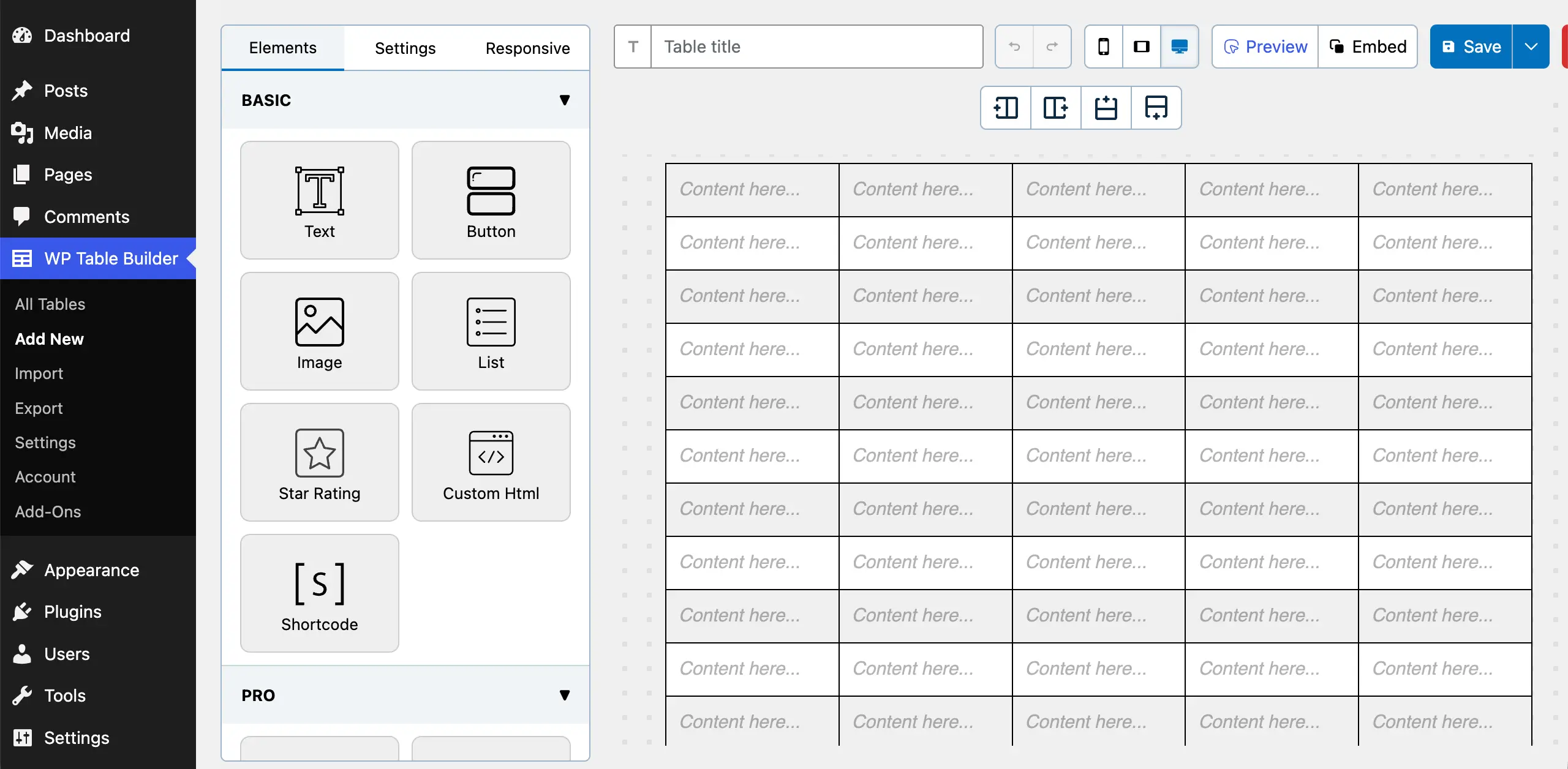
WordPress has a default table block in its editor. You can create only basic-level tables with the block. But when it comes to creating fashionable and well-stylized tables, the default block isn’t enough. You have to depend on additional plugins.
We’ll introduce you to such a plugin and explain how to create a feature comparison table in WordPress with it.
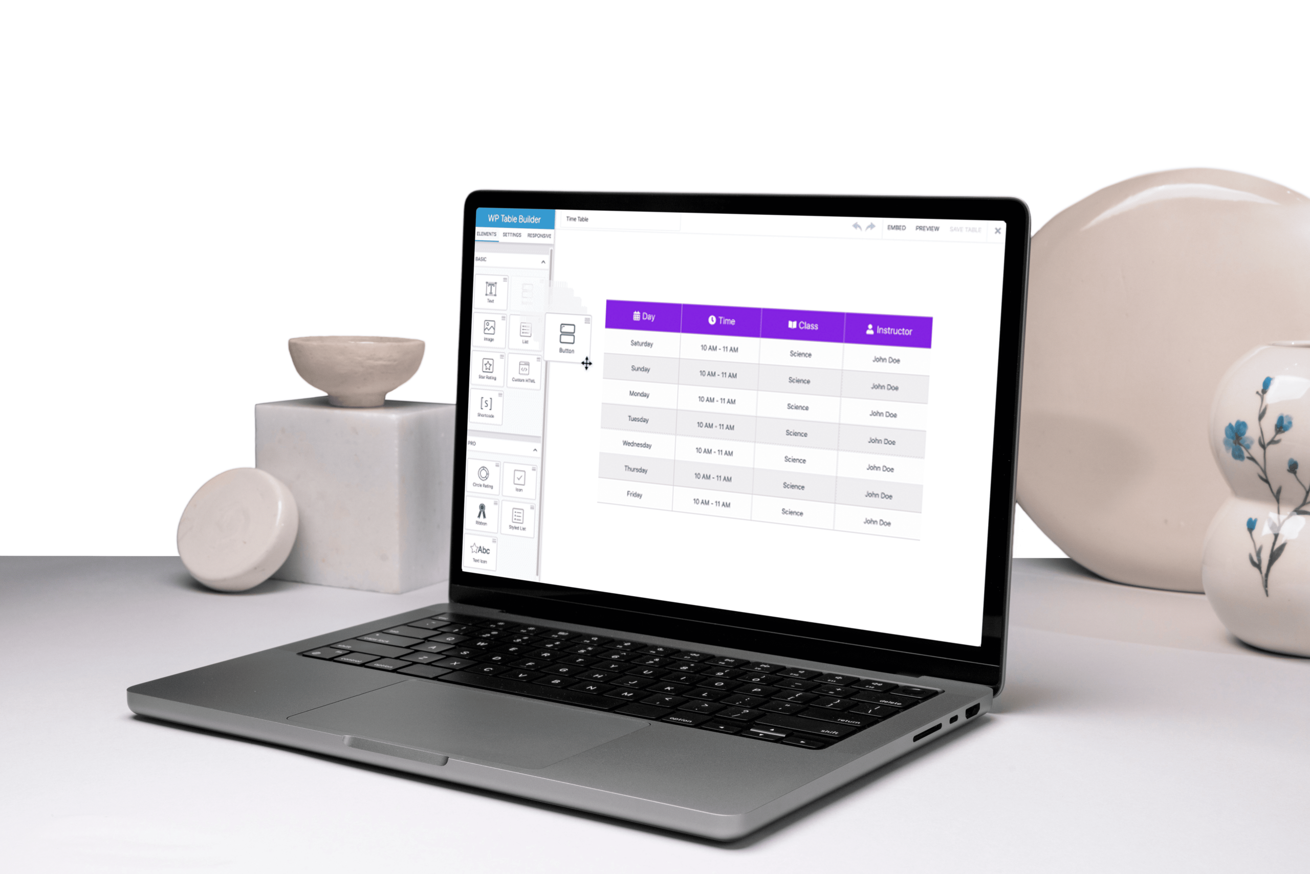
Step 01: Install the WP Table Builder Plugin
WP Table Builder is an extremely beginner-friendly drag-and-drop table builder plugin. You can create different types of presentable and highly converting tables on WordPress using this plugin.
Navigate to Plugins > Add Plugin. Type WP Table Builder in the search box. Once the plugin appears, install and activate it.
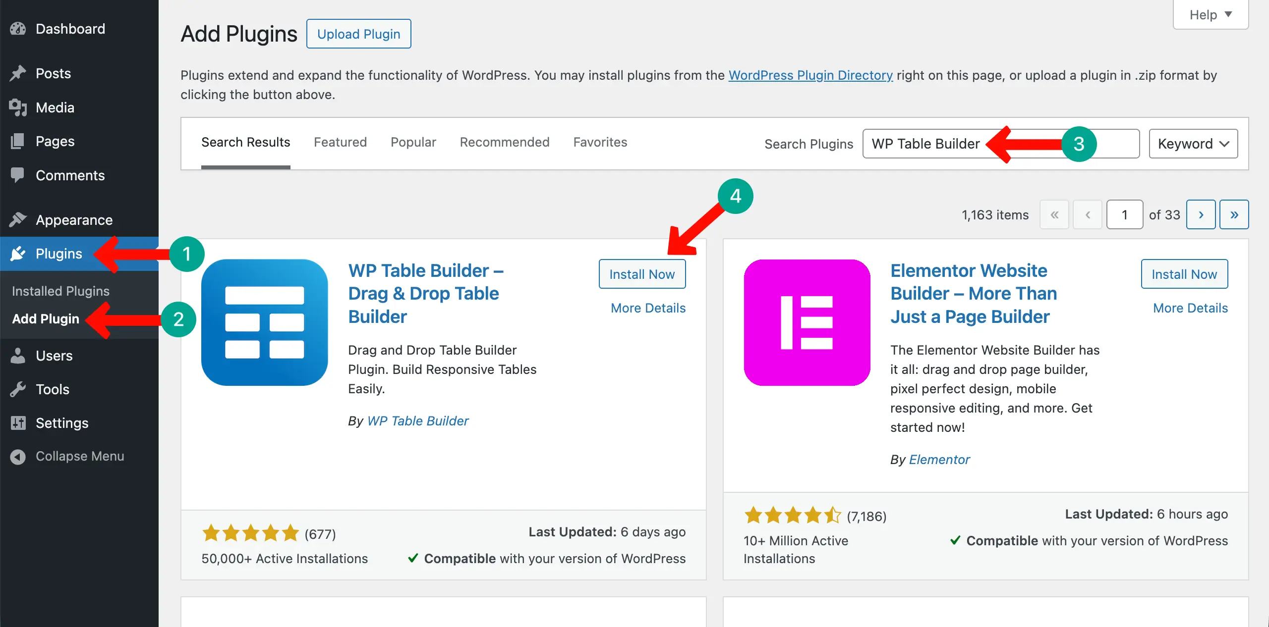
Obviously, like any other plugin, the free version of WP Table Builder has certain limitations, although it’s good enough for basic-level websites. But if you want to decorate your tables with more stylizations, you definitely need its premium version.
Check this guide on how to install and activate the WP Table Builder Pro.
Step 02: Set Up the Table Structure
Now, it’s time to decide the number of rows and columns you need to display all the information on the table. To do this, go to WP Table Builder > Add New. Set the number of rows and columns you want. Then, click the Create New button.
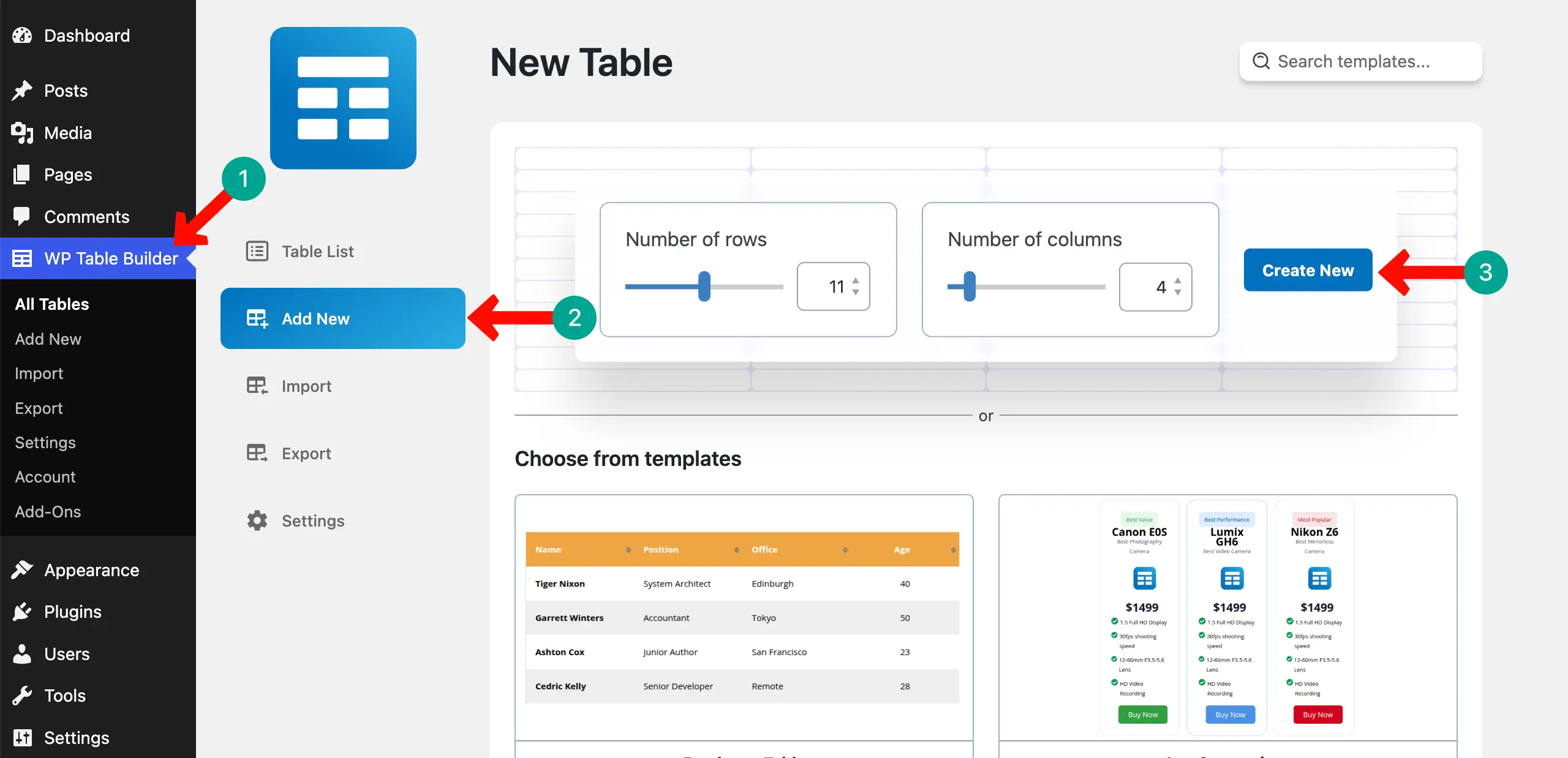
The table layout will instantly be created.
Step 03: Build the Header Row Including Plan Names
First of all, name all the columns of the comparison table in the top row. This row is called the header row.
Just place your cursor on those cells one by one and name them. You can even stylize the font from the Text Options on the left side.
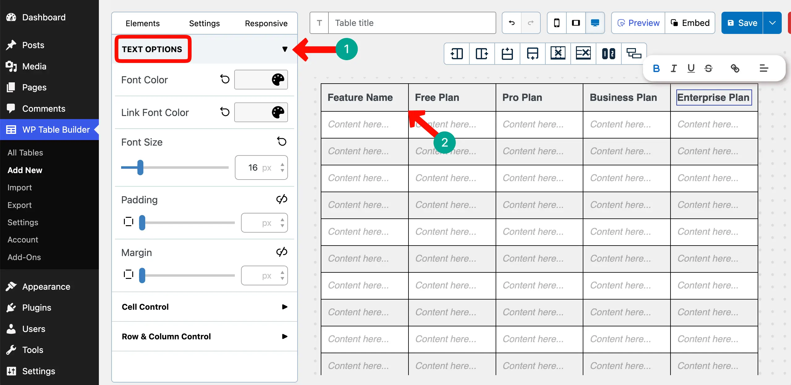
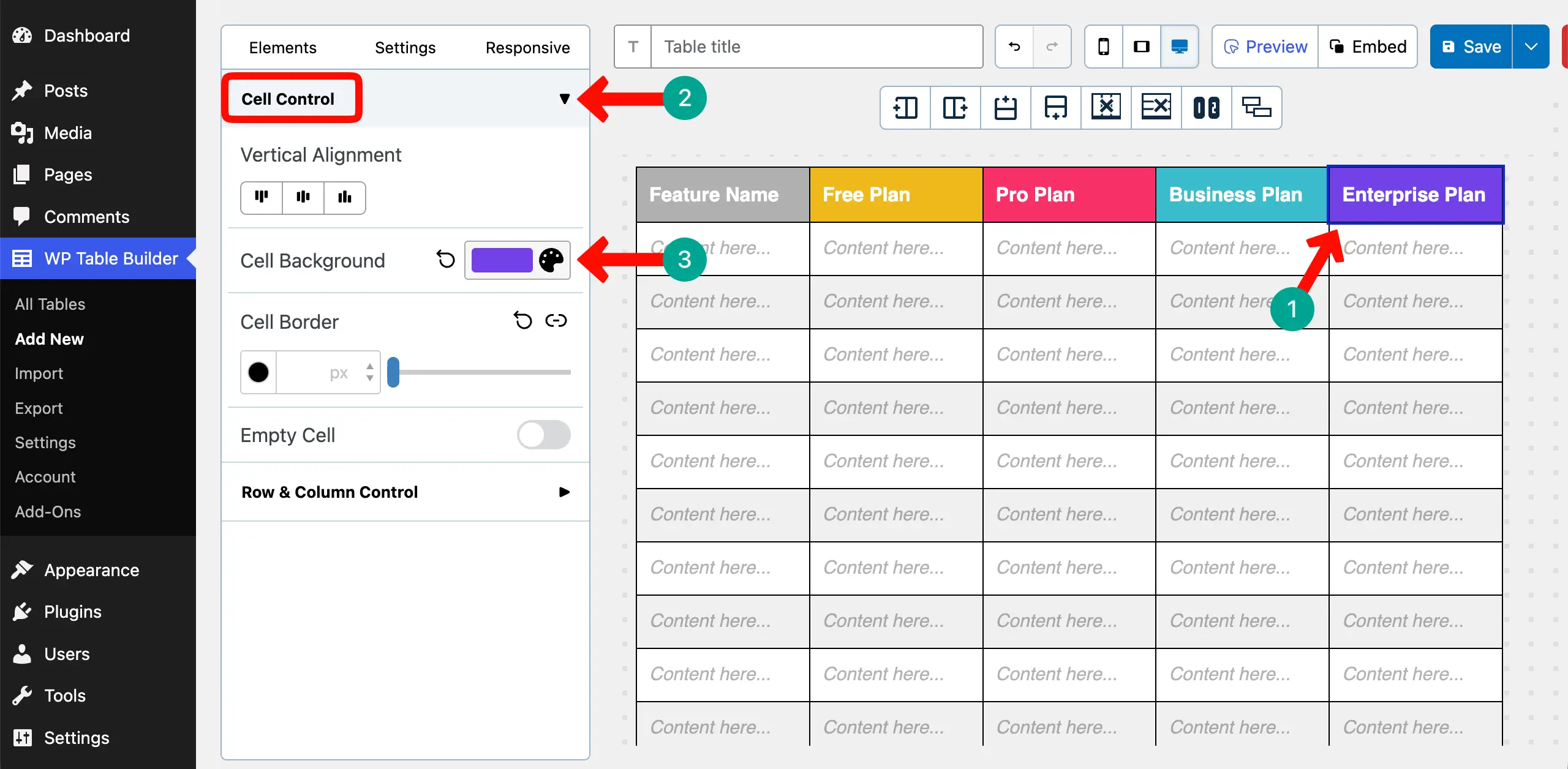
It’s better to colorize the background of the header row so the names of the respective columns become easy to read.
To do this, select each column by clicking on its border. Expand the Cell Control option on the left sidebar. Set the Cell Background color as you want.
Learn how to create a product specification table in WordPress.
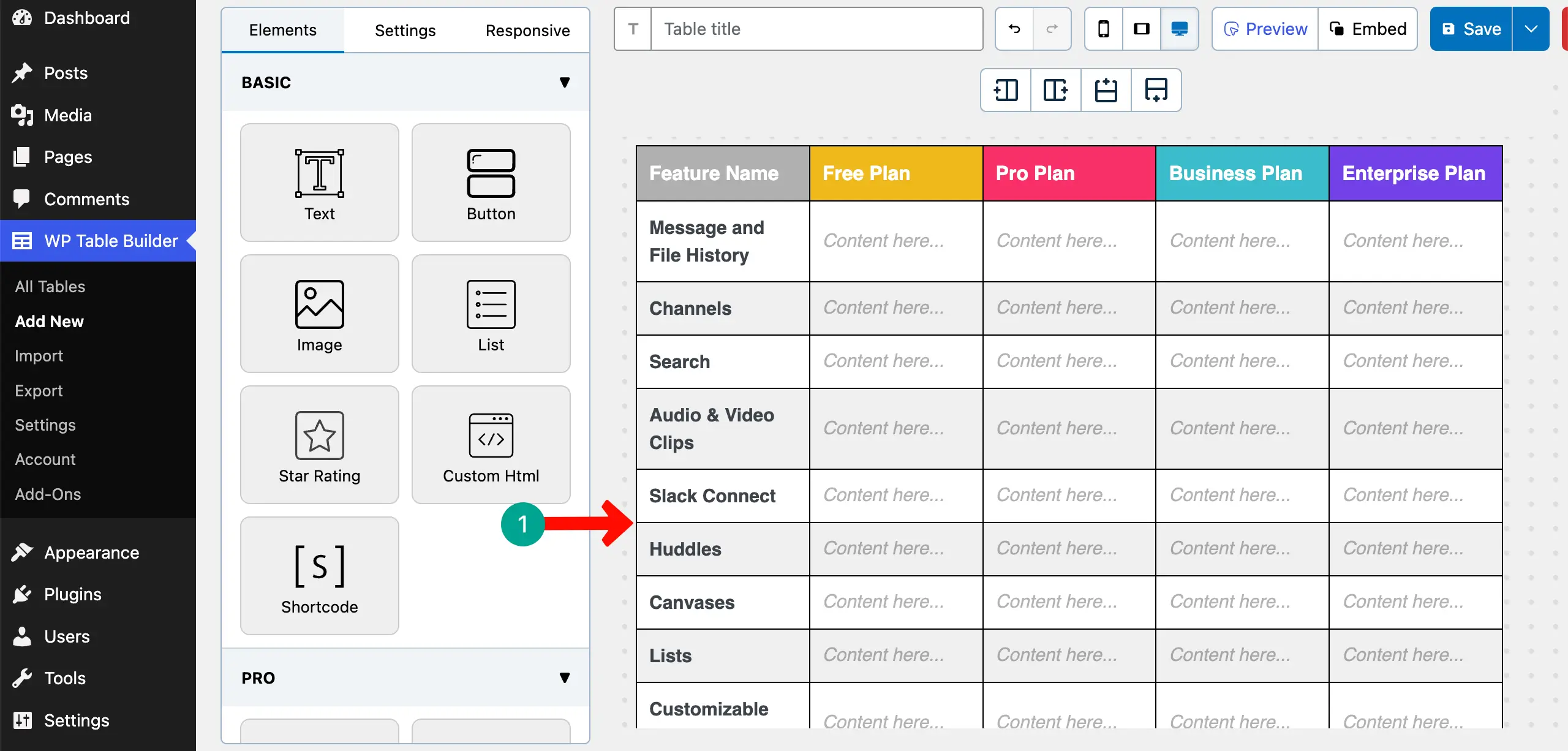
Step 04: Add Feature Names in the First Column
Place your cursor in the cells of the first column and write your desired features one by one. You can see that we have listed the feature names in the first column.
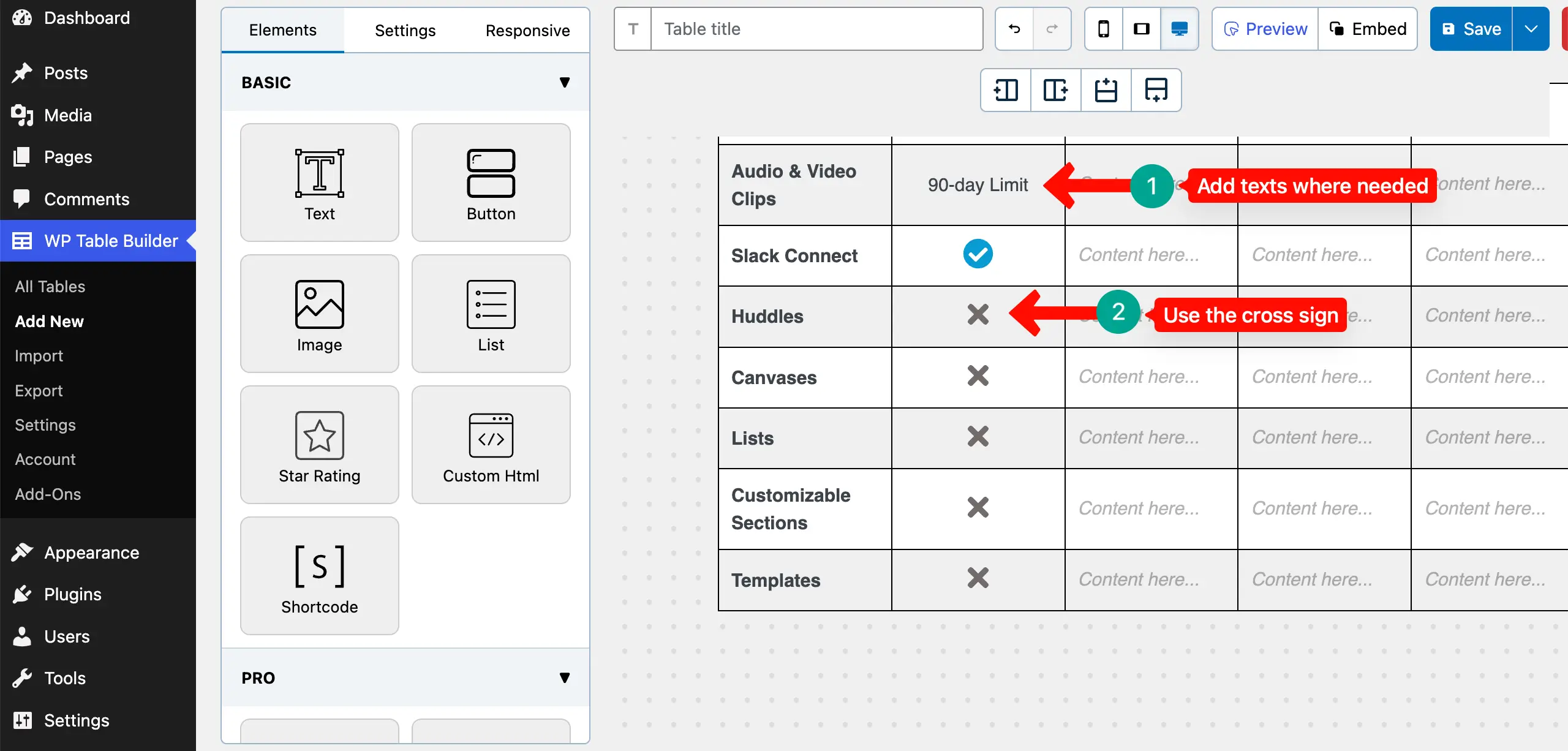
Step 05: Add Feature Availability Using Signs (✔ / — / Text)
It’s better to visualize the availability of features on the table using icons. To do this more easily, the plugin has the Icon Element.
Drag and drop the Icon Element on the respective cell in the table.
Once the icon widget is added, click on it if you want to change this.
Expand the Icon Item section. Click on the Icon on the right sidebar. An Icon library will open up. Explore the library by scrolling. Choose an icon you like.
After that, set a color for the icon if you want.
In the same way, add the icon to more cells on the table.
You can even add texts where icons aren’t enough. And for the features that aren’t available in the respective plan, you can use the Cross icon.
Explore the best WooCommerce product table plugins.
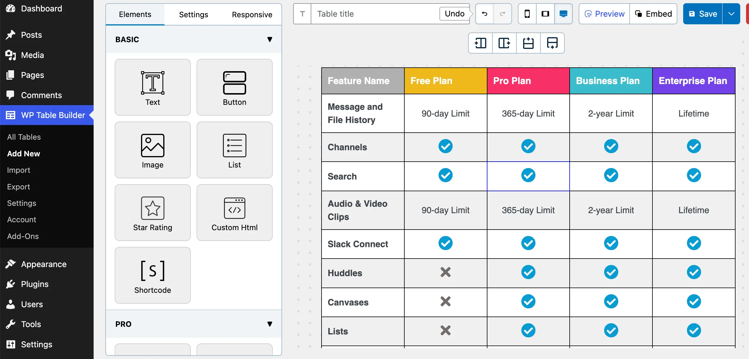
Step 06: Keep the Table Visually Consistent
Now, in the same way, complete the entire table by placing the necessary icons in the respective cells as we have done in the image below.
Step 07: Stylize the Column Border
Let’s do this here. Go to Settings tab > General. Find and toggle on the Separate Rows/Columns option.
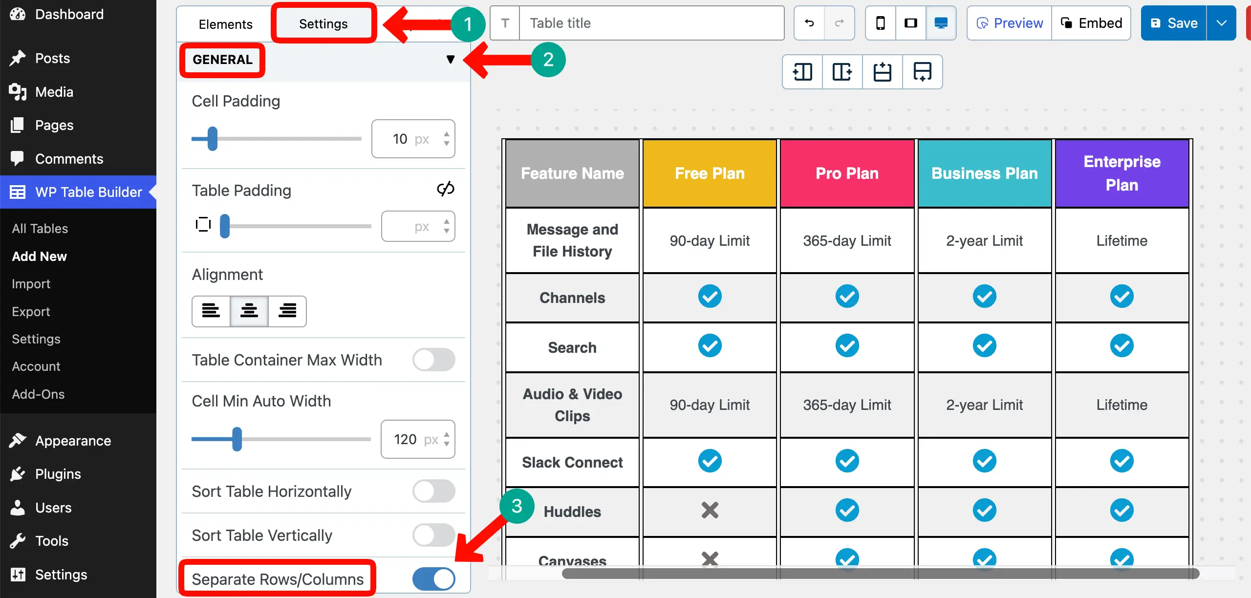
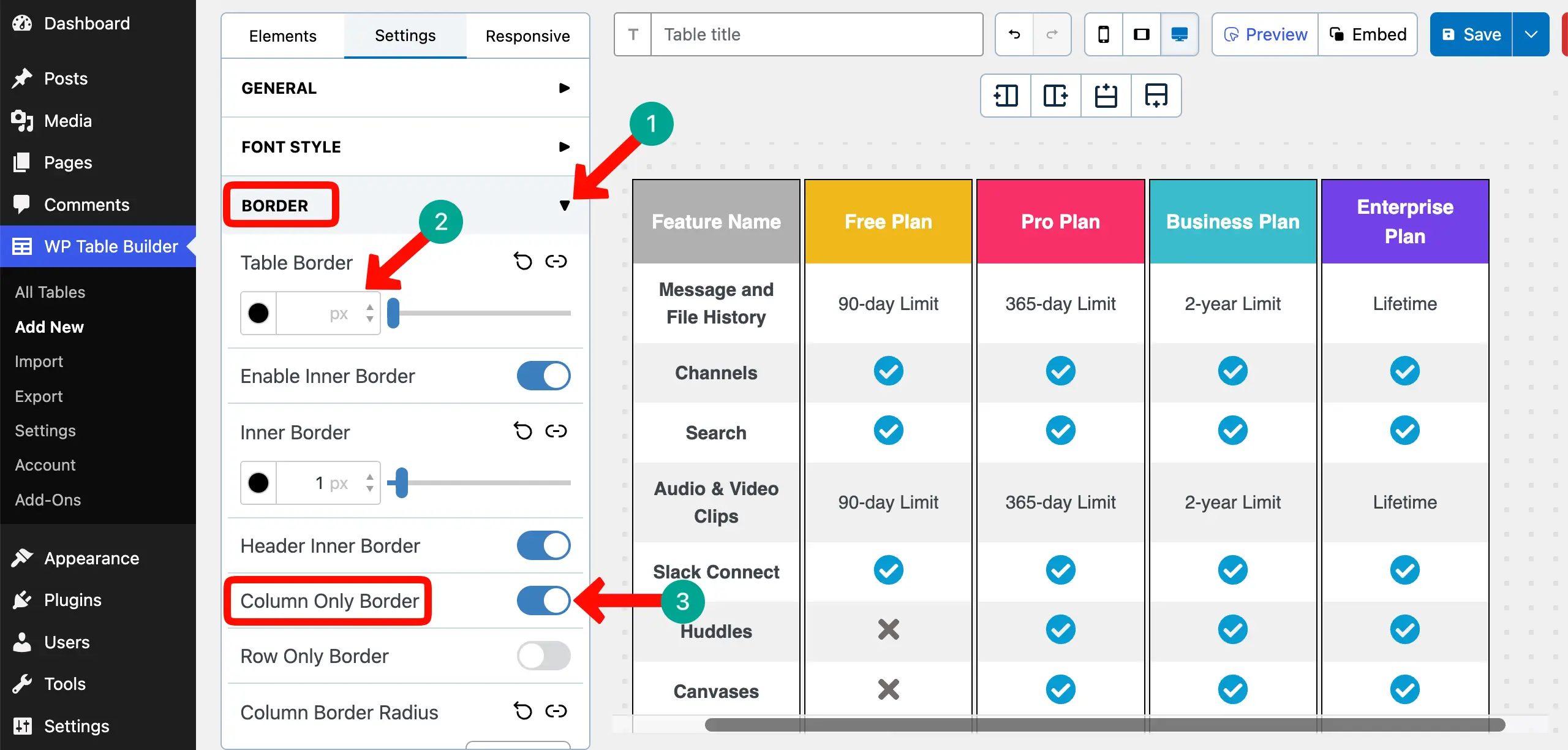
Next, expand the Border section. Then, remove the Table Border. Finally, toggle on the Column Only Border option.
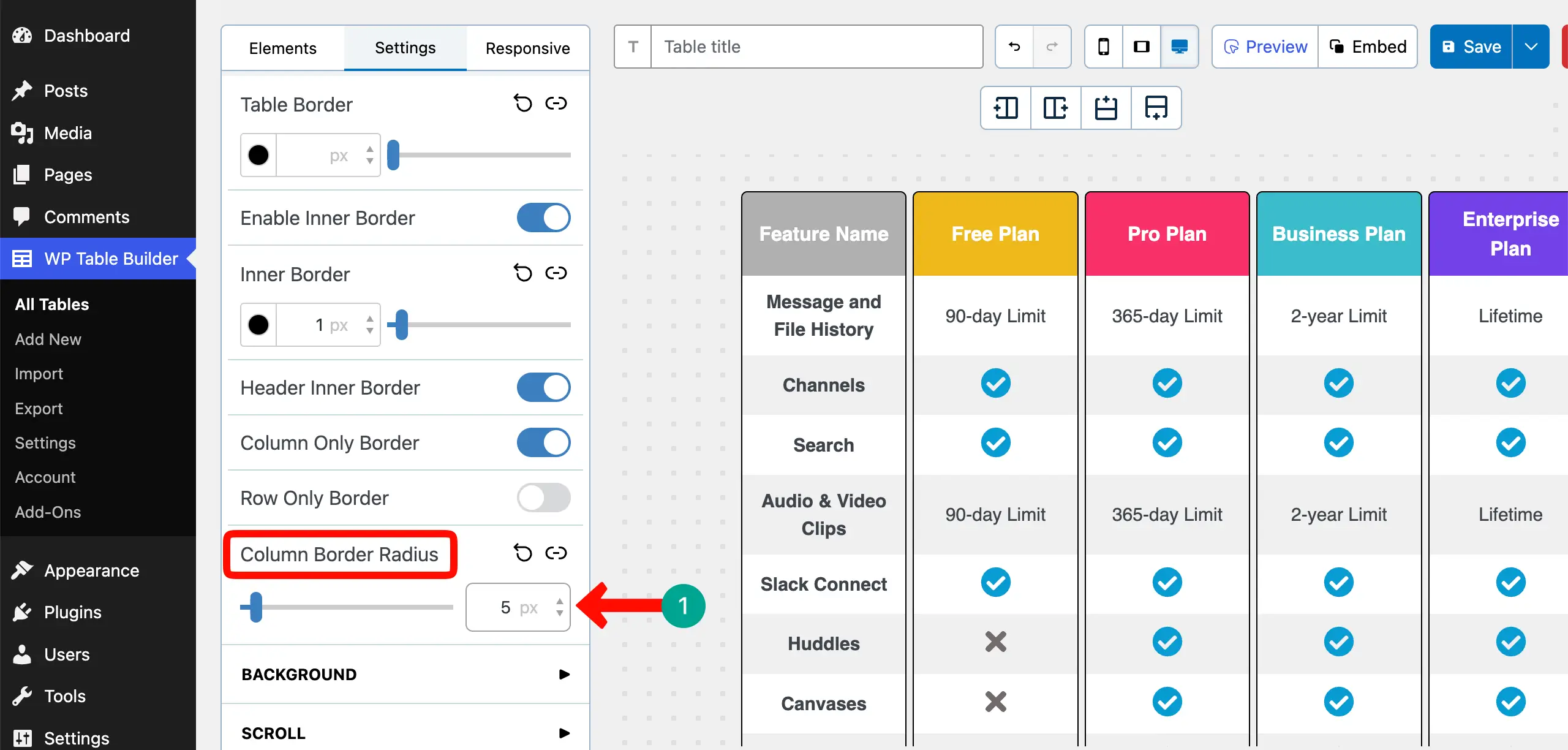
For better stylization, you can even add a radius to the corners of the table column.
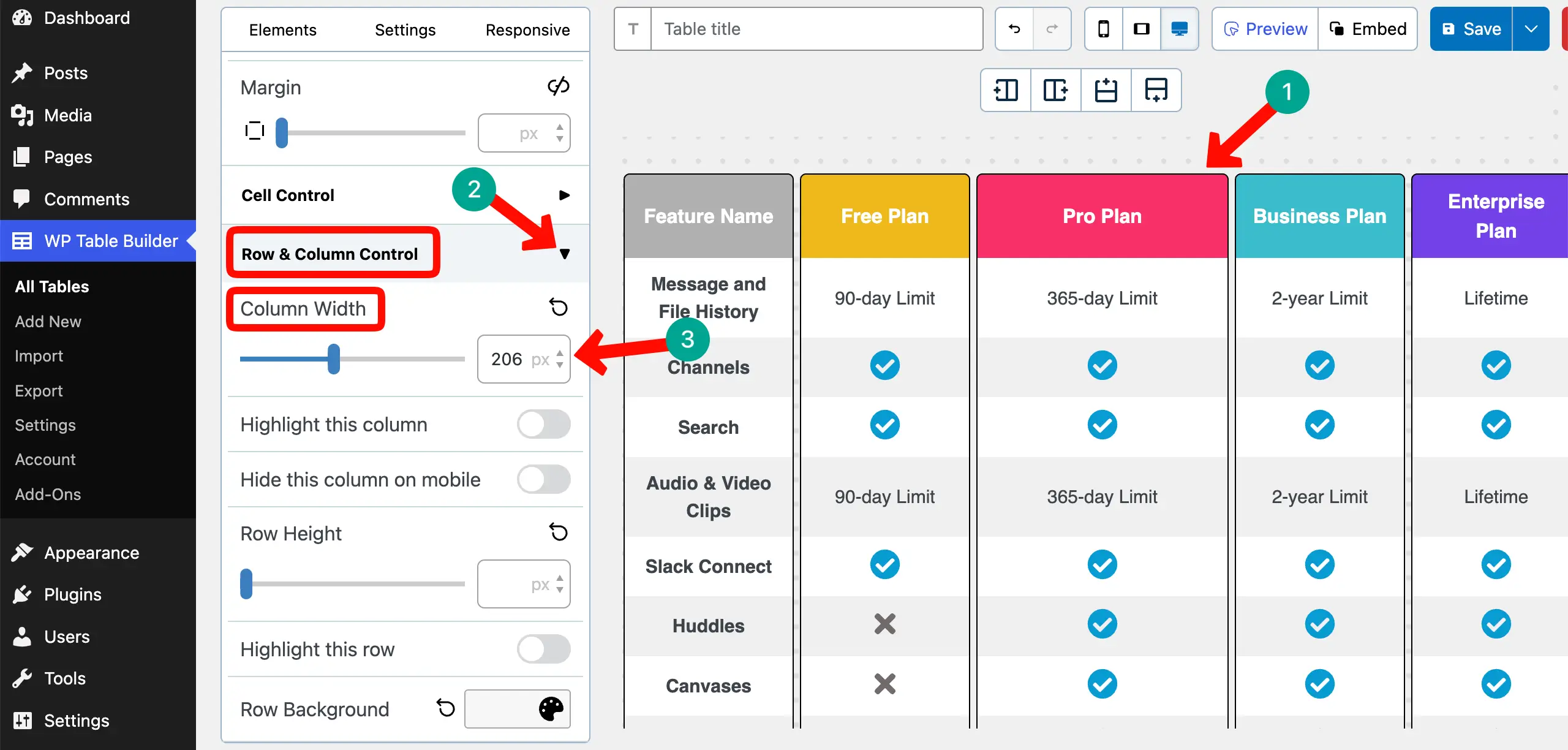
Step 08: Highlight an Important Column (Optional)
One proven strategy to convert customers and increase engagement through a pricing or feature table is to highlight the most suitable plan so that it can easily catch the attention of visitors.
Select any column you want. Expand the Row & Column Control section. Increase the value of the Column Width.
You’ll see the changes instantly.
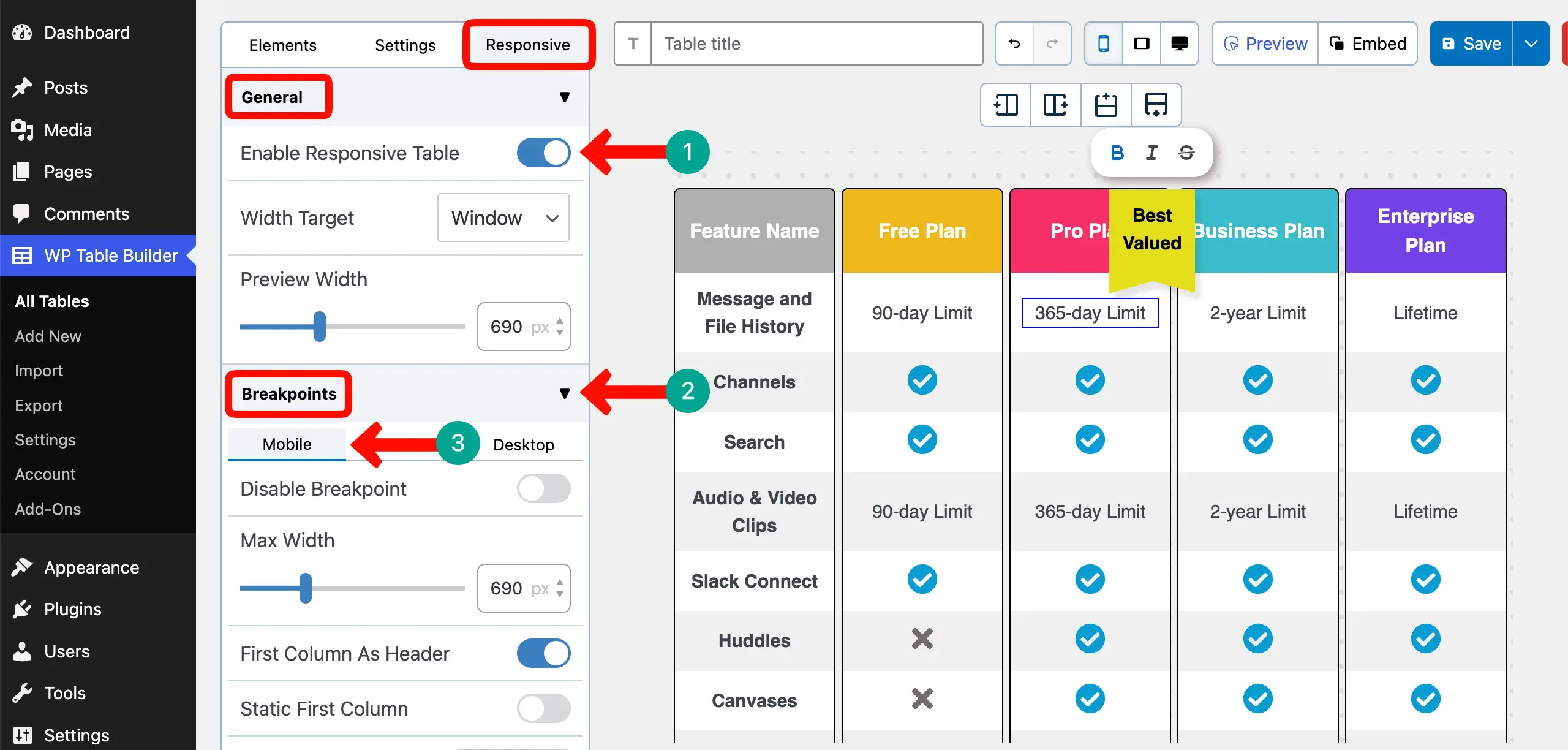
Step 09: Optimize the Table for Mobile Devices
Unless the table is optimized for mobile devices, it won’t work well on small screen sizes. Go to the Responsive tab. Expand the General section and toggle on the Enable Responsive Table option.
Next, expand the Breakpoints section. Switch between different device modes and set how the table should look on respective screen sizes.
Thus, you can optimize the table for mobile phones.
Take a look at the best TablePress alternative plugins.
Step 10: Run a Quick 10-Second Scan Test
Feature comparison tables work best when visitors can scan them within just 10 seconds. However, this time may vary depending on the length of the table. Now, let’s check whether your table passes this test.
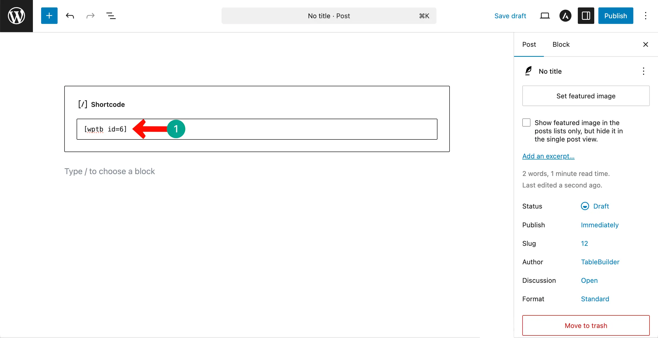
The plugin creates a shortcode for each table. You must place it in the Gutenberg editor to publish the table. By clicking the Embed button, copy the shortcode of the table.
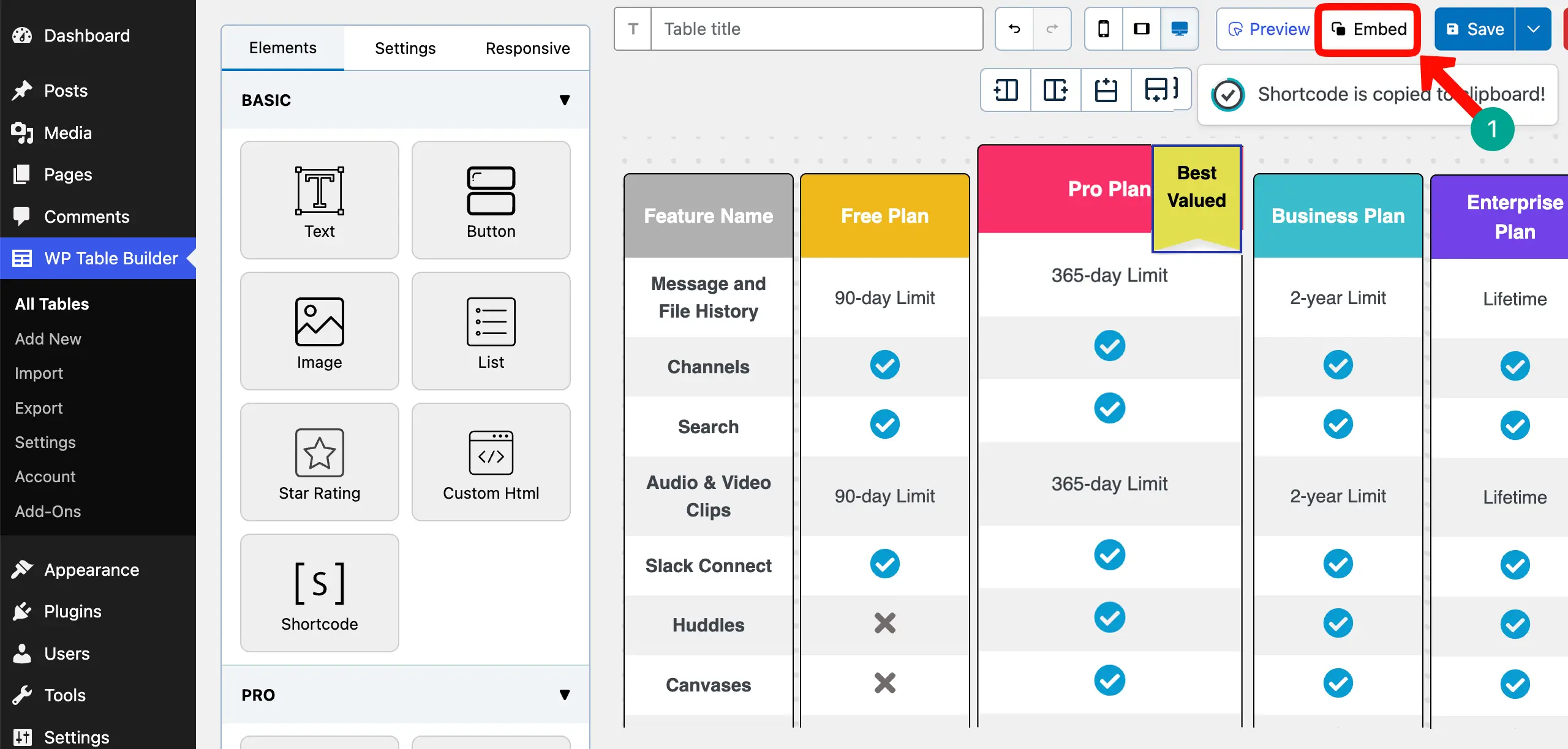
Place the shortcode in the editor and publish it.
Now, come to the preview page. Check if you can scan all the information at a glance without paying too much attention to reading it. If so, the table certainly passes the scan test.
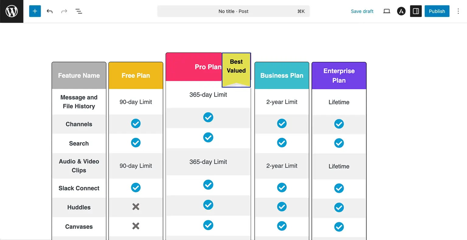
Thus, you can create a high-performing feature comparison table in WordPress. Take a look at the best pricing table optimization tips.
Common Mistakes to Avoid in the Feature Comparison Table
A feature comparison table can help users make quick decisions. But if it is not designed properly, it can confuse visitors instead of helping them. Below are some common mistakes that may ruin your all effort. Let’s check so you can avoid them.
1. Listing Too Many Features
Adding too many features makes the table long and hard to scan. Visitors may feel overwhelmed and skip reading it. Focus only on the most important and decision-making features. Keep the table clean and easy to understand.
2. Mixing Pricing and Features in the Same Table
When pricing details and feature explanations are mixed without clear separation, the table becomes messy. Users may struggle to understand what they are paying for. Keep pricing clear and organize features in a structured way so everything looks simple.Learn how to create a high-converting pricing table.
3. Using Inconsistent Wording Across Rows
If one row says ‘Available’ and another says ‘Included,’ it can confuse readers. Inconsistent wording makes the table look unprofessional. Use the same style and terms across all rows to keep the message clear and consistent.
4. Making All Columns Look Equally Important
If every column looks the same, users may not know which plan to choose. Highlight the most recommended or popular plan so it stands out. This helps guide visitors toward the best option for them.
5. Over-Styling with Colors and Icons
Too many colors, icons, or design effects can distract users. Instead of improving clarity, it can make the table harder to read. Use simple styling and only highlight what truly matters. Clean design always works better.
Final Thoughts: Feature Comparison Tables Are Decision Tools
Creating a feature comparison table in WordPress is not just about placing features inside rows and columns. It is about helping your visitors make confident decisions. When your table is clear, simple, and well-structured, people trust your offer more.
So take the time to build your table with care. Keep it focused, highlight what truly matters, and guide your visitors toward the best choice. Even small improvements can make a big difference in results.
With the right structure and smart design, your feature comparison table can become one of the strongest conversion tools on your WordPress website.
Leave a Reply
You must be logged in to post a comment.