

A large share of your visitors probably read your site on a phone, and tables are usually the first thing to break on a small screen. Columns get squeezed, text wraps one word per line, or the table spills off the side of the page. If your site has pricing tables, comparison tables or spec sheets, that is a problem you can see in your bounce rate.
In this guide, you will learn how to create responsive tables in WordPress. We start with the default Table block, then show you how to build a fully mobile friendly table with WP Table Builder, step by step.
What Is a Responsive Table?
A responsive table is a table that changes its layout to fit the screen it is viewed on. On a laptop it looks like a normal grid of rows and columns. On a phone it might scroll sideways, stack its cells into small blocks, or hide columns that are not essential, so the content stays easy to read without zooming.
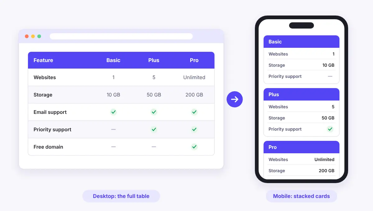
Tables are tricky because they are built for width. A five column comparison table that looks great at 1200 pixels has to fit into roughly 375 pixels on many phones. Something has to give, and a responsive table decides what gives in a way that still makes sense to the reader.
Common Ways to Make a Table Responsive
There is no single right method. The best choice depends on the kind of table you have. Here is a quick overview of the most common approaches:
Method | How it works | Best for |
1Horizontal scroll | The table keeps its full width and visitors swipe sideways to see the rest. | Data tables |
2Stack by row | Each row becomes its own small block, with the header label repeated next to every value. | Comparison tables |
3Stack by column | Each column turns into a card that sits on top of the next one. | Pricing tables |
4Hide columns | Less important columns disappear on small screens while desktop keeps them. | Detail-heavy tables |
5Sticky column PRO | The first column stays in place while the rest of the table scrolls. | Long tables |
This table was built with WP Table Builder. Open this page on your phone to see it change its layout.
Many good tables use more than one of these at once. For example, a comparison table can stack on phones and also hide a notes column that only matters on desktop.
Method 1: Make the Default Table Block Responsive
WordPress has a built-in Table block. It is fine for small text tables, and it gives you one basic responsive behavior: horizontal scrolling.
- Open a post or page and click the + button to add a block.
- Search for Table, choose the number of columns and rows, and click Create Table.
- Type your content into the cells. In the block settings, you can turn on a header section and choose whether cells have a fixed width.
- Preview the page in mobile view (the device icon at the top of the editor) to see how the table behaves.
With most themes, a wide Table block scrolls sideways on small screens. If your theme lets it overflow the page instead, you can add this small piece of CSS under Appearance > Customize > Additional CSS (or in the Site Editor styles for block themes):
.wp-block-table {
  overflow-x: auto;
}
That is about as far as the default block goes. It cannot stack cells, hide columns on phones or keep a column fixed while the rest scrolls. If you need any of those, or you want images, buttons and star ratings inside cells, a table plugin is the easier path. Our guide on why use a table plugin in WordPress explains the difference in more detail.
Method 2: Create a Responsive Table With WP Table Builder
WP Table Builder is a drag and drop table builder plugin for WordPress. Responsive settings are built into the free core plugin, with separate layouts for desktop, tablet and mobile. Here is how to use them.
Step 1: Install WP Table Builder and Create a Table
- In your dashboard, go to Plugins > Add New, search for WP Table Builder, then install and activate it.
- Go to Table Builder > Add New.
- Start from a ready-made template, or create a blank table and choose the number of columns and rows.
- Drag elements such as Text, Image, Button or Star Rating into the cells and add your content.
Already have the data in a spreadsheet? You can import a CSV file instead of typing it in. See how to import a CSV file and display it as a table.
Step 2: Turn On the Responsive Table Option
Open the Responsive tab in the builder. Under General, switch on Enable Responsive Table.
Next, pick a Width Target:
- Window switches layouts based on the width of the browser window. This is the right choice for most sites.
- Container switches layouts based on the width of the area the table sits in. Use it when the table lives in a narrow column or sidebar, where it may need the mobile layout even on a large screen.
Step 3: Set Up the Tablet Layout
Under Breakpoints, you will see three cards: Desktop, Tablet and Mobile. Desktop always shows the table as you built it. Click Tablet to change how the table looks on mid-sized screens. Changes you make here only affect the tablet layout.
- Max Width: the largest screen width that uses this layout.
- Stack Direction: choose Row to break each row into its own group, or Column to stack each column like a card. Column works well for pricing tables where each plan is a column.
- First Row As Header (or First Column As Header, depending on the stack direction): repeats your header labels next to the stacked values so readers always know what each value means.
- Static First Row (or Static First Column): keeps the header in its original position instead of repeating it.
- Items Per Head: how many cells are grouped under each header when the table stacks.
Step 4: Set Up the Mobile Layout
Now click the Mobile card and repeat the process for phones. On most tables, a single item per head with the first row as header gives the cleanest result on a narrow screen.
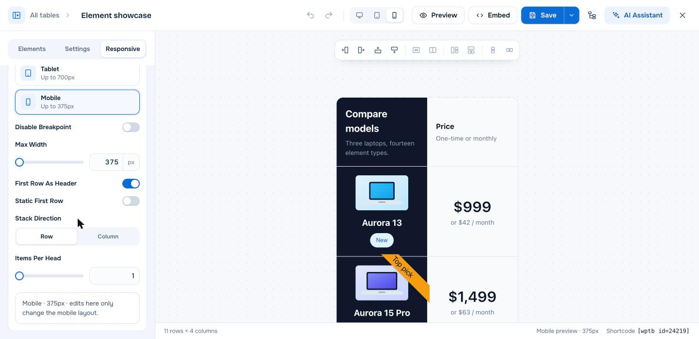
Use the Preview Width field under General to check the table at any exact width, such as 360 or 414 pixels, without leaving the builder.
Step 5: Hide Columns That Are Not Needed on Phones
Some columns are nice to have on desktop but just add clutter on a phone, such as a notes column or a product code. Select a cell in that column, open the column settings and turn on Hide this column on mobile. The column stays visible on larger screens.
Step 6: Use Horizontal Scrolling for Wide Data Tables
Stacking is not always the best answer. For a large data table, such as a schedule or a list of numbers, readers often prefer to keep the grid and swipe sideways. In the table settings, open the Scroll section and turn on Enable horizontal scrolling.
If you use WP Table Builder Pro, the Sticky settings let you make the first row or first column stay in place while the rest of the table scrolls, so the labels never leave the screen.
Step 7: Save and Add the Table to Your Page
- Click Save in the builder.
- Open the post or page where the table should appear.
- Add the WP Table Builder block and select your table, or paste the shortcode, which looks like
[wptb id="123" not found ]. - Update the page and check it on a real phone.
Because the table is saved in one place, any change you make in the builder updates the table everywhere you have embedded it.
Tips for Mobile Friendly Tables
- Keep header labels short. When a table stacks, the header repeats next to every value. “Price” reads better than “Monthly price billed annually”.
- Put the most important column first. Readers scan from the left on desktop and from the top on mobile.
- Use fewer columns where you can. If a table needs eight columns, ask whether it should be two smaller tables.
- Make buttons easy to tap. Give buttons enough padding so they are comfortable to press with a thumb.
- Optimize images in cells. Large product photos slow down mobile pages. Compress them before you upload.
- Match the method to the table. Stack pricing and comparison tables, and let big data tables scroll.
Building a specific kind of table? These guides go deeper: how to create a pricing table in WordPress and how to create a feature comparison table.
How to Test Your Table on Mobile
Previews are helpful, but always check the live page too. A few quick ways:
- Use your own phone. Open the published page and scroll through the whole table, holding the phone upright and sideways.
- Use browser developer tools. In Chrome, Edge or Firefox, open the developer tools and switch on device mode to try different screen sizes.
- Clear your cache. If you use a caching plugin, clear it after changing table settings so you are not looking at an old version.
Frequently Asked Questions
Are WordPress tables responsive by default?
Partly. The default Table block usually scrolls sideways on small screens, depending on your theme. It cannot stack cells or hide columns. For those layouts you need a table plugin such as WP Table Builder.
Is the responsive feature in WP Table Builder free?
Yes. The Responsive tab with separate tablet and mobile layouts, hiding columns on mobile and horizontal scrolling are all part of the free plugin. Sticky rows and columns are a Pro feature.
Should I stack my table or let it scroll on mobile?
Stack tables that compare a few items, like pricing plans or products. Let large data tables, such as schedules or reports, scroll sideways so readers can still compare values across a row.
Can I use different layouts for tablets and phones?
Yes. WP Table Builder has separate Tablet and Mobile breakpoints, each with its own max width, stack direction and header options, while desktop keeps the table as you built it.
Do responsive tables help SEO?
Google uses the mobile version of your pages for indexing, so content that is easy to read on a phone gives visitors a better experience. A table that breaks on mobile can make people leave the page quickly.
Conclusion
For a small text table, the default Table block with horizontal scrolling may be all you need. For pricing tables, comparison tables and anything with images or buttons, a responsive table builder gives you far more control over how the table looks on every screen.
With WP Table Builder, you can set separate tablet and mobile layouts, stack cells, hide extra columns and preview the result before you publish. New to table plugins? Start with our guide on how to create a table in WordPress, or compare options in our list of the best WordPress table plugins.
Leave a Reply
You must be logged in to post a comment.