A pricing table is not just a list of plans and prices. It is the place where visitors decide whether they will trust you with their money. Many businesses spend months improving their product, but only a few hours designing the pricing page. That is a big mistake.
A clear and well-structured pricing table can increase conversions without changing the product at all. Most visitors do not leave because your price is too high. They leave because they feel confused. They cannot clearly see the difference between pricing plans.
In this guide, we’ll share some practical pricing table optimization tips to help you convert visitors into customers. We’ll incorporate this guide with real examples from trusted companies like Stripe, Shopify, and Notion. Hope you will enjoy it a lot.
Tip 01: Limit Choices to Reduce Decision Fatigue
When visitors land on your pricing page, they want clarity, not complexity. If they see too many plans, their brain shifts from deciding to comparing. That comparison takes effort. Limiting choices means reducing mental load so users can decide quickly and confidently.

What to Do for Reducing Decision Fatigue
Keep your pricing table to 3 plans. Three is ideal because it creates natural contrast: low, middle, and high. And it’s better not use the pricing table for experimentation unless you have a clear purpose and strategy in mind.
If you have special vision, you may stretch the table to 4 plans. But again, don’t do this for experimentation or whimsy. There is strong data behind this structure.
Why This Helps Visitors Decide Faster
Three-tier pricing tables show a predictable pattern called the 66-23-11 rule. According to Harvard Business Review –
Around 66% of customers choose the middle plan. 23% choose the lowest plan. Only 11% choose the highest premium plan.
This means most people naturally move toward the center option. If you have more than three plans on the pricing table, there is a high chance they will struggle to make a final decision. In special cases, you may have four plans, but don’t do this only for experimentation.
RingCentral found in an A/B testing that switching from four plans to three increased conversions by over 37%, while reducing plans to two decreased conversions. Actually, customers have a natural tendency to prefer the middle item in a horizontal or vertical array.
Learn how to create a high-converting pricing table in WordPress.
Real Example
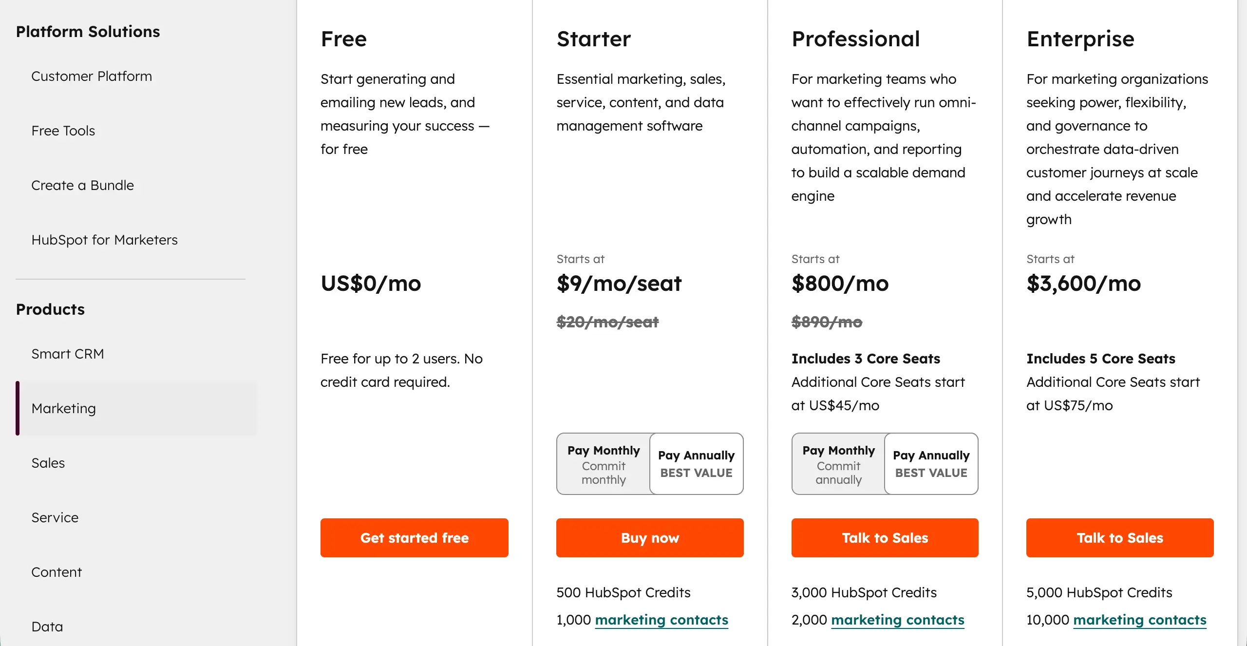
HubSpot uses a simple three-plan structure on most of its pricing pages. Each plan is clearly separated and easy to understand. There are no unnecessary variations shown at first glance. This clean structure makes comparison simple and quick.
Note: You might be confused, as there are four columns in the table. Actually, the free plan doesn’t necessarily belong to the main pricing table. Most software companies and service agencies offer a limited free trial so that users can get an idea about their product.
How to Apply This in WordPress
When creating your pricing table in WordPress, begin with exactly three columns and design the layout around that structure. Keep spacing consistent and feature rows aligned so comparisons feel balanced. Avoid adding extra columns solely to display all offers at once.
If you have additional plans, do not crowd the main table. Place them on a separate page and add a small link like “View all plans” below the table. This keeps the primary decision focused while still allowing advanced users to explore detailed options.
Tip 02: Visually Highlight the Recommended Plan
When visitors compare multiple plans, they naturally look for a safe or standard choice. If there is no clear visual signal, they spend extra time comparing every feature. That extra effort creates hesitation. Highlighting one plan gives them mental support.
What to Do for Highlighting a Plan
To highlight a plan effectively with an aesthetic appeal, there must be a combination of both design and content. You may consider the following things to do this.
- Use Visual Contrast
Make your target plan stand out with a different background color, a thicker border, or a slightly larger column size. The difference should be noticeable but not aggressive.
- Add a Descriptive Badge
Place a ribbon or badge at the top of the column. Use labels like ‘Most Popular,’ ‘Best Value,’ or ‘Recommended.’ This instantly signals that this is the preferred choice.
- Enhance the Call-to-Action (CTA)
Give the highlighted plan’s button a stronger, high-contrast color. The button should attract attention without breaking your overall design balance.
Why This Helps Visitors Decide Faster
Visually highlighting a plan uses the Center-Stage Effect, a cognitive bias where items in the middle appear more important.
Consumers often select the central option, assuming it’s the most popular or best-recommended product. Recent data reveals that conversion increases by 13.2% when plans are highlighted well. Highlighting a plan also boosts profits and attention.
According to McKinsey & Company, businesses that use smart pricing and show plans clearly have increased their profits by up to 6%. Studies also show that when people scan pages in an “r” pattern, they notice highlighted plans faster and pay more attention.
Real Example
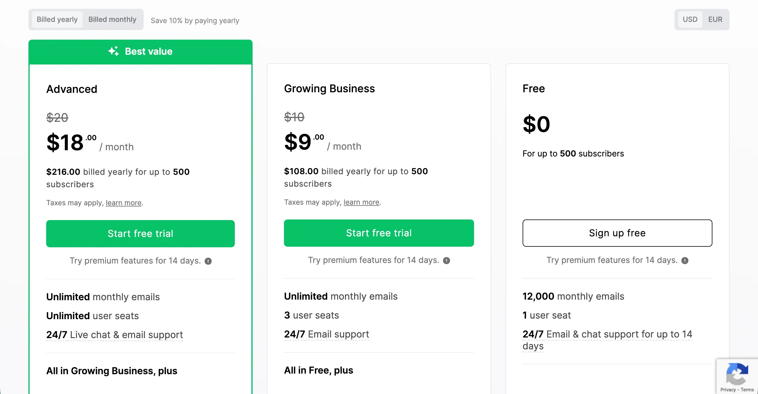
Below is the pricing table of Mailerlite, a well-known digital marketing solution. You can see it has multiple plans. But they have highlighted one of them, naming ‘Best Value.’ They have used a borderline with a distinguishable color to make it look different.
How to Apply This in WordPress
Most WordPress pricing table plugins include a built-in option to feature a column.
- Use a Background Color and a Border
Highlight the entire column by changing its background color and adding a border. Make sure it stands out from other plans but still looks clean and professional.
- Add a Ribbon or Badge
Look for a ‘Badge’ or ‘Ribbon’ option inside the block settings. Add short text like ‘Most Popular’ and position it at the top of the highlighted column for maximum visibility.
- Highlight Subtle, Not Flashy
Keep the highlight subtle. Avoid bright or flashy colors. The goal is to guide users’ eyes without overwhelming them or breaking the page design.
Tip 03: Use Plan Naming That Signals Who Each Plan Is For
When someone visits your pricing page, they want to find the right option quickly. Generic names like “Plan A” or “Level 1” make them read all the features to figure out if the plan suits them. This wastes time and can feel confusing.
Instead, you can use plan names that show exactly who the plan is for. This helps visitors find their match in seconds and makes choosing the right one easier.
What to Do for Clearer Signaling
Use descriptive labels that explain the ideal user for each plan. Make these labels easy to see and read. For example:
- Best for Beginners – for the entry-level plan.
- For Growing Teams – for the mid-level, popular option.
- For Large Businesses or Custom – for high-end enterprise plans.
Why This Helps Visitors Decide Faster
When a plan is clearly labeled for a specific type of user, visitors instantly understand if it applies to them. They don’t need to read every feature or compare multiple plans. This reduces mental effort and speeds up the decision-making process.
People naturally look for the option that fits their situation. By signaling the target audience with labels like “Best for Beginners” or “For Growing Teams,” you create instant recognition. This self-selection builds confidence and encourages faster, more certain purchases.
Real Example
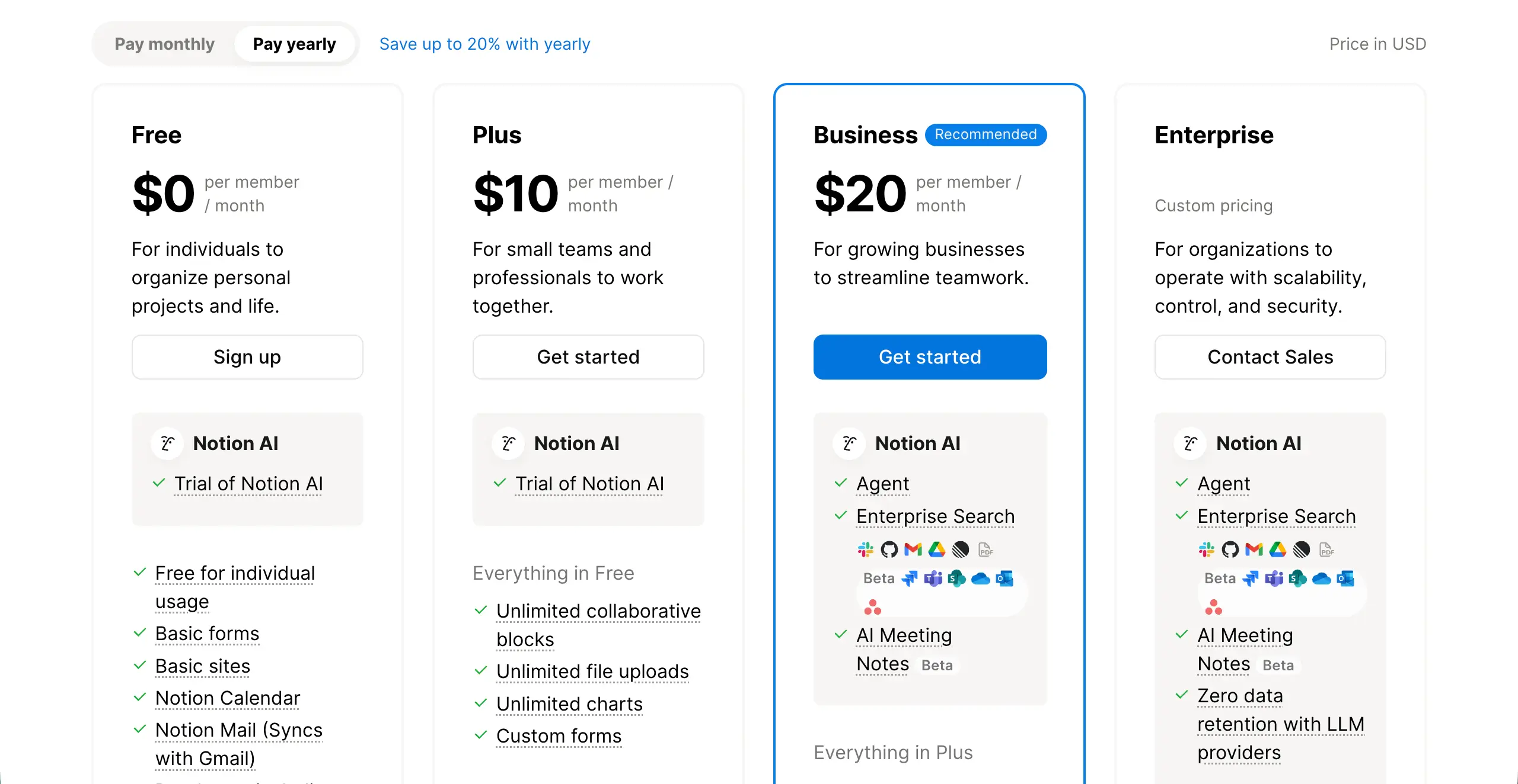
Notion does this really well. Their plans are labeled like ‘Free for individuals,’ ‘Plus for small teams,’ ‘Business for growing businesses,’ and ‘Enterprise for organizations.’ Visitors can immediately find the plan that fits them without reading every feature.
How to Apply This in WordPress
Doing this on pricing tables is also as simple as the other tips. But you need to ensure you maintain the following points.
- Add a Sub-header: Place a small text under the plan name with your ‘Best for…’ label.
- Use Badges: If your pricing table plugin supports it, add a small ribbon or badge to show who the plan is for.
- Keep it Short: Use 2–4 words per label. The goal is a quick signal, not a full explanation.
Using clear plan naming like this makes your pricing page faster to understand and increases the chances visitors choose the right plan quickly. Check the best pricing table WordPress plugins.
Tip 04: Show Discounts Clearly to Highlight Value
When visitors see only one price, they have no reference point. They do not know if the price is high or fair. Because of this, they may hesitate. But when you show a higher original price first and then a discounted price, you give them a better and clearer comparison.
This helps them move their focus from the cost to the savings. So, instead of thinking about spending money, they start thinking about getting a deal.

What to Do for Showing Discount Clearly
To show discounts properly, you need both clear numbers and smart visual design. These small changes can make a big difference.
- Show the Original Price Using Strikethrough
Display the previous or regular price with a line through it, like $99. This is your anchor. It tells visitors, ‘This was the real value before.’ When they see the lower price next to it, the discount feels real and attractive.
- Emphasize the Current Price Visually
Your discounted price should stand out the most. Make it larger than the other text. Use bold font. Use a strong, high-contrast color. The current price must be the first thing people notice in that column.
- Add a Simple “Save $X” Message
Do not let visitors calculate savings in their heads. Tell them clearly. Add a small message like “Save $20” or “20% Off.” This removes mental effort and strengthens the feeling of getting a good deal.
Why This Helps Visitors Decide Faster
There is a strong research background behind this claim. According to growthsuite.net,
Reference pricing with strike-through displays increases purchase intent by 20–30% compared to showing a sale price alone.
Besides, when visitors see a discounted price immediately on a product page rather than only at checkout, conversion rates improve by 25–40%. Price anchoring actually works because of a common mental bias.
The first number people see becomes the standard in their mind. This is called the “Reference.” Next, the discounted price feels smaller and more affordable.
Instead of asking, “Is this expensive?” They ask, “Is this worth it?” The value becomes clear in simple math.
Learn how to create a horizontal pricing table in WordPress.
Real Example
Hostinger is a well-known web hosting company. If you visit its pricing page, you’ll see a higher pricing figure in a comparatively smaller font with a strikethrough. They set this price by evaluating the standard hosting rates in other well-known hosting platforms.
Below the reference prices, they set a sales price with a comparatively bigger font. Thus, they optimize the pricing table.
How to Apply This in WordPress
Most WordPress pricing table blocks and plugins allow custom text and styling options.
- Use Text Styling for Crossed-Out Prices
Use the “strikethrough” option in your editor for the original price. If your tool does not have this feature, you can use an HTML block and apply the <s> tag manually.
- Make the Final Price Larger and Colorful
Adjust the typography settings. Make the current price at least 20–30% larger than the surrounding text. Use a darker or stronger color so it stands out clearly.
- Place Savings Messages Near the Plan Header
Add your “Save $X” message near the top of the column. You can use a badge, subtitle, or small label above the price. This ensures visitors see the value immediately when scanning the table.
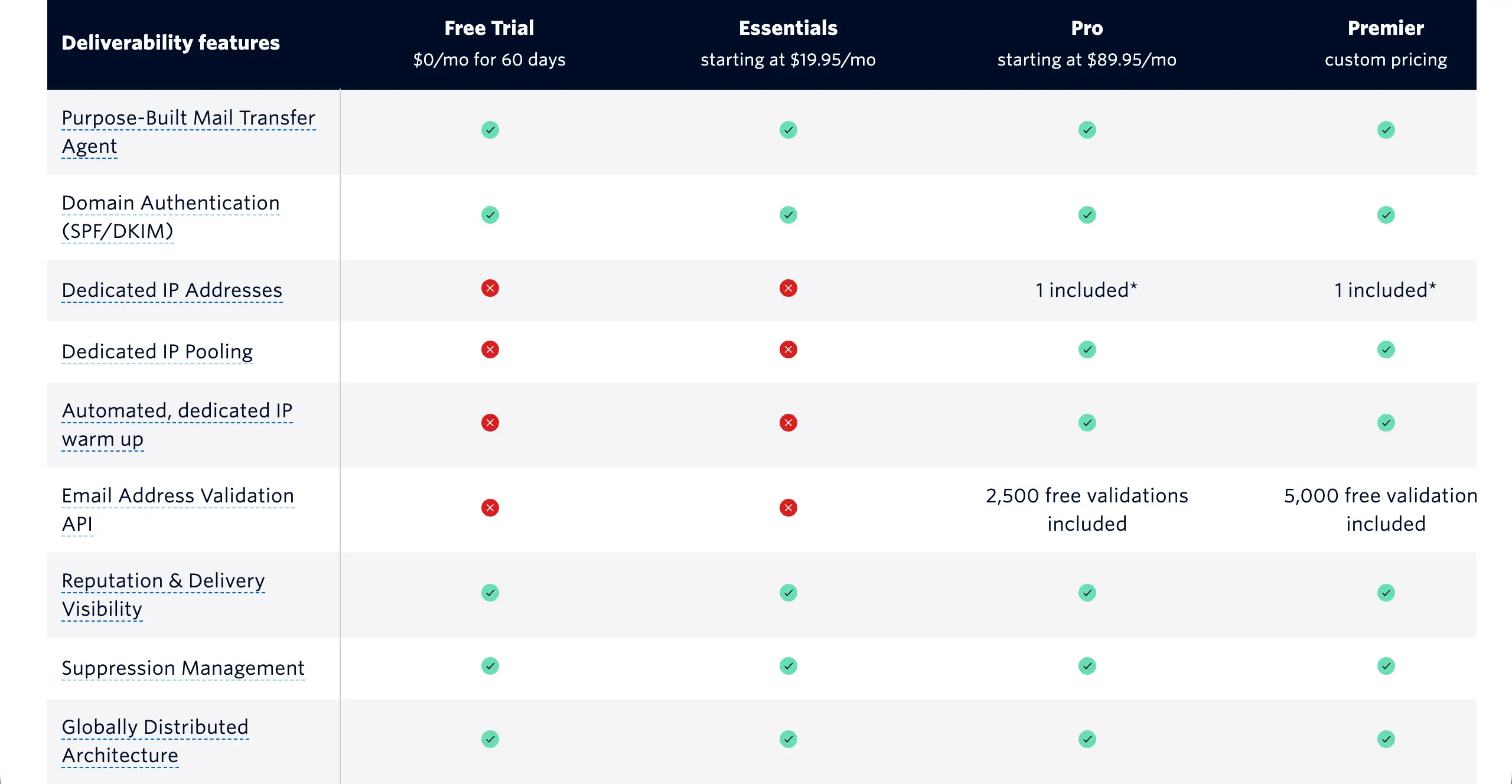
Tip 05: Make Feature Differences Scannable, Not Readable
Most visitors do not read pricing tables word by word. They scan. Their eyes move quickly from top to bottom and left to right. If your features are written in long sentences, users will feel tired.
But if your layout is clean and visual, they can understand differences in seconds. So, your goal is not to make them read but help them scan.
What to Do for Making Features Scannable
Keep all features in the same order for every plan. Do not change the sequence. When rows are aligned properly, users can compare columns instantly without thinking.
- Use Icons
Icons convey messages faster than words. A simple checkmark ✔ means “included.” A cross ❌ means “not included.” Visitors can understand without reading the full texts.
- Avoid Long Feature Descriptions
Keep feature names short and clear. Do not write full sentences inside the table. If a feature needs explanation, add a small tooltip icon instead of extra text.
Why This Helps Visitors Decide Faster
Users scan patterns, not sentences. The human brain detects shapes and symbols much faster than text. When features are aligned and supported by icons, comparison becomes visual. Visitors do not need to read every word.
Besides, icons reduce mental effort, and short text reduces confusion. When scanning becomes easy, decisions become faster.
Real Example
SendGrid is a well-known email marketing solution. it uses very clean comparison tables. Their pricing pages rely heavily on checkmarks and aligned feature lists. This allows visitors to compare plans quickly without reading long descriptions.
How to Apply This in WordPress
Keep feature wording identical across all columns. Use icons together with short text. Most WordPress page builders and table builder plugins allow you to add icon lists easily. If a feature is not available in a plan, apply a ❌ icon or use strikethrough text.
This keeps the structure balanced and honest. When users can compare your plans in five seconds without reading long lines, your pricing table is working correctly.
Tip 06: Reduce Fear By Adding Trust Signals Close to the Action Button
Many visitors feel ready to buy. But right before clicking the button, they hesitate. They think, ‘What if this does not work for me?’ This small fear can stop the decision. If you add trust signals near the action button, you remove that fear at the exact moment it appears.

What to Do for Reducing the Fear
Adding a simple trust element close to your main CTA button can remarkably reduce the fear. These elements could be:
- Money-Back Guarantee: A clear refund policy lowers risk. Even a short line like ’30-day money-back guarantee’ builds confidence.
- Cancellation Note: Tell users they can cancel anytime, so they won’t be charged at the next renewal time. This makes the commitment feel flexible, not locked.
- User Count or Social Proof: Mention how many people are already using the product. For example, ‘Trusted by 10,000+ users.’ This shows others have already made the same decision.
Keep these trust elements short and direct. They should calm users, not overwhelm them.
Why This Helps Visitors Decide Faster
According to a Trustpilot Consumer Trust Report,
71% of consumers are more likely to complete a purchase if the website displays trust signals or ‘risk-reduction’ messaging (like guarantees).
From another report, a simple trust signal (like ‘No credit card required’ or ‘Cancel anytime’) directly under a CTA can increase conversion rates by up to 20%.
It’s because trust signals lower perceived risk. When risk feels low, action feels safe. And when action feels safe, decisions happen faster.
Real Example
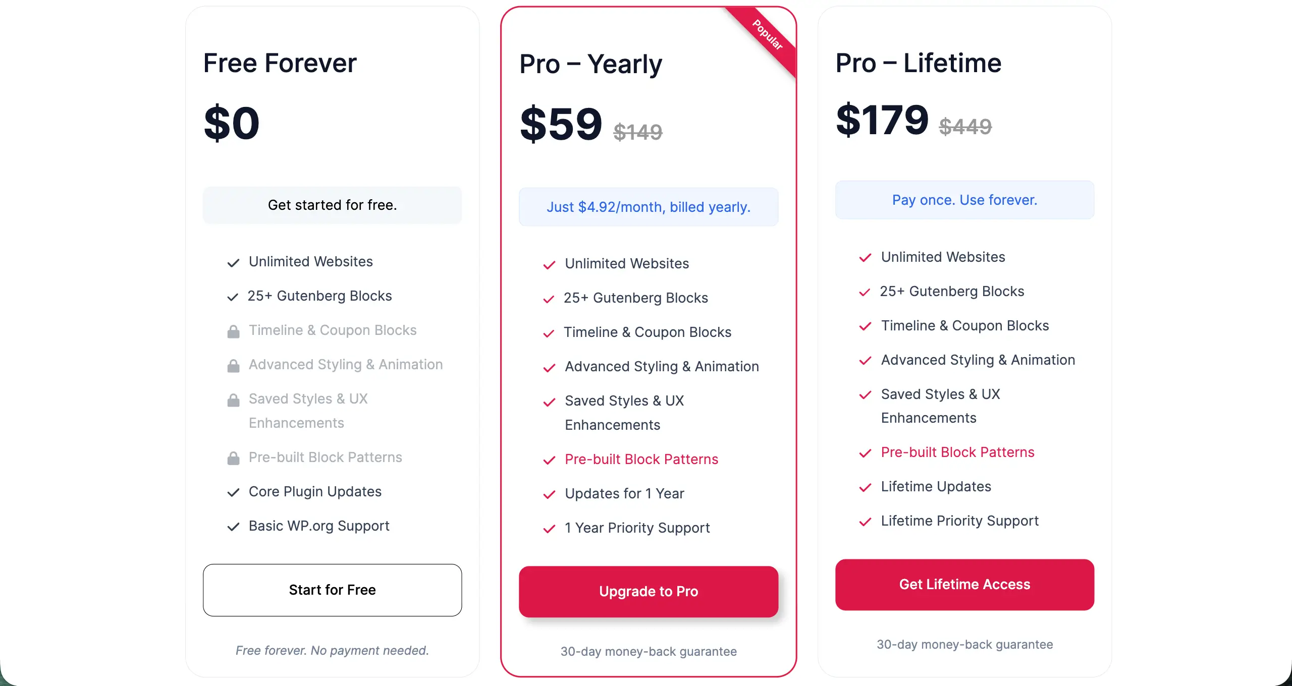
Ultimate Blocks is a promising block plugin for the Gutenberg editor with 25+ custom blocks. You can see that they mention ’30-day money-back guarantee’ right below the CTA button, so it can easily catch people’s eyes.
How to Apply This in WordPress
Add a small text row directly below your pricing button. Keep the text simple and factual. For example:
- Cancel anytime
- 30-day money-back guarantee
- Used by 10,000+ people
- No hidden fees
Do not use hype or promotional language in this area. Avoid words like ‘amazing’ or ‘incredible.’ This space is for reassurance, not marketing.
Tip 07: Match CTA Language to Commitment Level
Your button text carries emotional weight. If the words feel too strong for the offer, visitors may hesitate. If the words match the level of commitment, the action feels natural and safe. The CTA should reflect what the user is actually agreeing to.
What to Do for Matching CTA Language
Adjust your button text based on the plan type. You can consider the following suggestions in the CTA copy.
- Free plan: Use soft and safe language like ‘Start Free’ or ‘Try for Free.’ This reduces fear because users know there is no payment risk.
- Paid monthly plan: Use action-based but balanced language like ‘Upgrade Now’ or ‘Get Started.’ This feels like progress, not pressure.
- Lifetime plan: Use clear ownership-focused wording like “Get Lifetime Access.” This highlights long-term value.
Do not use the same CTA text for every plan. Each plan has a different commitment level. Your wording should reflect that difference.
Why This Helps Visitors Decide Faster
According to Baymard Institute – E-commerce Checkout UX Research,
70% of online buyers feel more confident when the button explains the result.
For example, ‘Start My Trial’ feels clearer than ‘Sign Up.’ Result-based language reduces confusion. It also reduces decision stress.
From another report, using soft and low-pressure words like ‘Get’ or ‘Start’ instead of ‘Buy’, ‘Submit’, and ‘Order’ can increase clicks by up to 90%.
Clear wording, built with softness, can build trust and empathy, which ultimately leads visitors to decide faster.
Real Example
Slack adjusts CTA wording carefully based on plan type. Their free plan invites users to start without pressure. Paid plans use upgrade-focused language that reflects the added features and cost.
How to Apply This in WordPress
Customize each button’s text individually inside your pricing table settings. Avoid using generic CTAs like ‘Buy Now’ for every plan.
Think about what the user is truly doing when clicking the button. Then choose words that make that action feel simple and safe.
Tip 08: Optimize the Table for Mobile Decision-Making
Over 50% of users visit websites on mobile devices today. So, if your pricing table isn’t optimized for mobile screen sizes, you’ll miss a significant number of potential customers. However, optimizing pricing tables for small screens is really difficult.
On a small screen, a three-column table becomes hard to read. Text looks crowded. Comparisons feel messy.
What to Do for Mobile Optimization
Mobile pricing needs a different structure. It should feel simple and focused. You can consider the following points for optimizing your pricing tables for mobile phones.
- Stack Plans Vertically on Mobile: Instead of showing plans side by side, stack them one below another. This makes each plan easier to read.
- Preserve Highlights and Ribbons: If one plan is marked as ‘Most Popular’ or ‘Recommended,’ keep that highlight visible on mobile. Do not remove badges or visual emphasis when stacking.
- Show One Plan per Screen: Design the spacing so that users mainly see one full plan at a time. This creates focus. It prevents visual overload.
Why This Helps Visitors Decide Faster
Mobile users do not compare plans the same way desktop users do. On a desktop, people compare side by side. On mobile, they scroll. This means mobile users decide sequentially, not comparatively. They look at one plan, scroll, then look at the next.
If too many elements appear at once, the brain feels overloaded. But when users see one plan clearly at a time, mental effort decreases. Less effort leads to faster decisions.
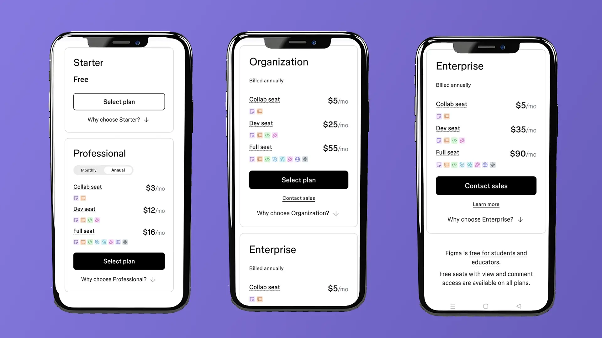
Real Example
Figma stacks its pricing plans cleanly on mobile devices. The layout stays organized. Important highlights remain visible. Each plan feels clear and easy to evaluate while scrolling.
How to Apply This in WordPress
Enable responsive stacking in your pricing table block or plugin settings. Today, all the most modern page and pricing table builders allow you to set breaking points or apply different layouts, especially for mobile screen sizes.
Preview the mobile version before publishing. Do not rely only on the desktop view. Check if spacing, button size, and text readability are perfect for small screens. Once everything is perfect, publish it.
Tip 09: Use Subtle Urgency Without Pressure
Urgency can trigger users to make decisions faster. But there is a big difference between gentle encouragement and aggressive pressure. If users feel pushed, they may lose trust. If they feel guided, they are more likely to act. The goal is to create motivation without creating fear.

What to Do for Creating Subtle Urgency
In the following ways, you can create a sense of subtle urgency in the pricing page on different occasions.
- Highlight Savings: Show clear savings like ‘Save $40 per year’ or ‘20% Off Annual Plan.’ This gives users a reason to act now without feeling forced.
- Emphasize Best Value or Popular Choice: Add a small ribbon that says ‘Best Value’ or ‘Most Popular.’ This gives social guidance. Many users prefer choosing what others choose.
Keep the tone calm and informative. The message should feel helpful, not dramatic.
Why This Helps Visitors Decide Faster
A study published in the Journal of Marketing Research found that
While urgency can increase short-term sales, ‘aggressive’ or ‘artificial scarcity can actually lower a consumer’s long-term evaluation of the brand.
Besides, according to a report by Sprout Social, 94% of consumers are likely to be loyal to a brand that offers complete transparency. So, always be authentic and create subtle urgency if you don’t want your brand to be destroyed.
Real Example
Kinsta is a popular platform for managed WordPress hosting. It uses a calm value framing on its pricing pages. Instead of dramatic countdown timers, it simply shows how much you can save by subscribing to those respective plans annually.
How to Apply This in WordPress
We have already suggested some similar approaches above.
- Small Ribbons: Using a small ribbon or badge, you can display copies, like ‘Save $40’ or ‘Best Value’ at the top of a pricing column.
- Avoid Countdown: Don’t use this element randomly. You can definitely use it during the campaign period, but not always.
Finally, keep your urgency messages short and factual. When urgency feels honest, visitors move forward with confidence instead of doubt.
Tip 10: Run the 10-Second Pricing Table Test
Your pricing table may look beautiful. But beauty does not guarantee clarity. Visitors do not study your page carefully. They scan it quickly. If they cannot understand it within seconds, they may leave. That is why you need the 10-second test.

What to Do for the 10-Second Test
To run the 10-second test, ask yourself the following three simple questions:
- Can users identify the recommended plan in 3 seconds?
When someone lands on the pricing page, the ‘Best Value’ or ‘Most Popular’ plan should stand out instantly. If it blends with the others, your hierarchy is weak.
- Can they understand why it’s better in 5 seconds?
The benefits of the recommended plan should be obvious. Users should quickly see more features, better value, or savings without reading long text.
- Can they find the CTA in 10 seconds?
The action button must be easy to spot. It should be clear, visible, and placed where users expect it. No hunting. No confusion.
Why This Helps Visitors Decide Faster
Online attention spans are short. Besides, people do not buy what they do not understand. If clarity fails in the first few seconds, conversions drop. And this happens no matter how good your price is.
The 10-second test forces you to remove clutter. It helps you focus on structure, hierarchy, and clarity. When understanding is instant, decisions become faster.
Real Example
GitHub has pricing pages that pass this quick-scan test. The layout is clean. The recommended plan is easy to notice. Features are structured clearly. Buttons are visible without effort.
How to Apply This in WordPress
We have already provided some questions above that you should ask yourself regarding the pricing page. We are mentioning them once again:
- Is the recommended plan clear?
- Is the value difference obvious?
- Is the button easy to find?
Step back from your screen. Pretend you are a first-time visitor. Scroll to your pricing table. Count 10 seconds. Do not read deeply. Just scan.
If you fail to get answers quickly to these questions, your pricing table definitely needs adjustment and simplification.
Find out what slows the understanding. Remove it, shorten text, improve spacing, and strengthen visual contrast.
Best Plugins to Create High-Converting Pricing Tables in WordPress
You will find numerous great plugins in WordPress to create high-converting pricing tables. Let’s get introduced to the two best ones.
WP Table Builder
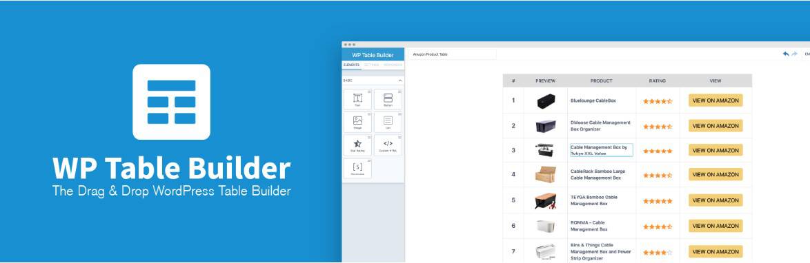
WP Table Builder is a drag-and-drop table plugin. It gives full control over layout, column width, background colors, ribbons, buttons, and feature rows. This makes it easy to apply all the pricing optimization tips discussed above. You can create as many columns as you want and highlight a recommended one.
You can stylize it with contrast, add badges like ‘Most Popular,’ style strikethrough prices, insert icons for feature comparison, and place micro-reassurance text under CTAs. It also offers pre-designed templates for pricing tables, responsive stacking for mobile, and flexible content elements inside cells.
Tableberg
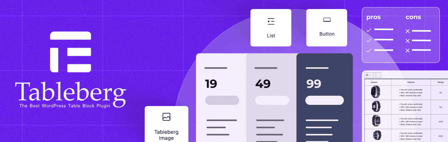
Tableberg is a modern block-based table builder designed for the Gutenberg editor. It allows you to build structured pricing tables using native blocks with advanced styling controls. You can easily create column layouts, visually highlight a featured column, customize CTA buttons, add badges, and maintain consistent feature rows with icons.
Its strong, responsive behavior helps stack plans properly on mobile, which supports faster decision-making. Tableberg also focuses on clean design and performance, which keeps pricing tables lightweight and fast-loading. It offers flexibility while still supporting all major high-conversion pricing strategies discussed in this guide.
Final Thoughts: Faster Decisions Come From Clarity, Not Pressure
A high-converting pricing table is not about tricks. It is about clarity. When visitors understand your plans quickly, they feel confident. Simple structure, clear feature comparison, honest CTAs, etc., all work together to remove confusion and make them confident.
Pressure may create short-term clicks, but it damages trust. Fake urgency, complex layouts, and unclear messaging increase doubt. Instead, focus on making your pricing easy to scan, compare, and trust. When users clearly see value, they do not need to be pushed.
In the end, better conversions come from a better understanding. If your pricing table answers questions in seconds, highlights value naturally, and removes fear near the action button, visitors will move forward on their own.
Leave a Reply
You must be logged in to post a comment.