

A table should make information easier to understand. But a badly designed table does the opposite. Heavy grid lines, crowded cells, random colors and mixed units turn a simple comparison into a puzzle, and most visitors will not stay long enough to solve it.
The good news is that most table design mistakes are easy to spot and quick to fix. In this guide, you will see the 10 most common problems, why they hurt readability, and exactly how to fix each one in WordPress with WP Table Builder.
What Makes a Table Badly Designed?
A table is badly designed when the reader has to work hard to find an answer. The data itself might be correct, but the layout hides it. Maybe the header row looks the same as the rest, every cell has a thick black border, or one column says “10GB” while the next row says “20 gigabytes”.
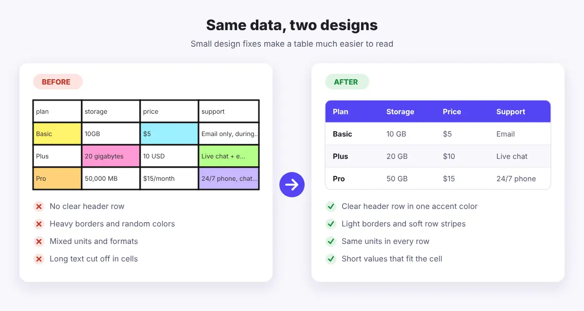
Look at the two tables above. They hold exactly the same plans and prices. The one on the right is easier to read because it follows a few simple rules: a clear header row, light borders, soft row stripes, consistent units and short values. Those rules are what the rest of this guide is about.
10 Common Table Design Mistakes (and How to Fix Them)
Each mistake below includes the problem, the fix, and where to find the right setting in WP Table Builder. Most of these settings are in the free version of the plugin. Where a feature needs WP Table Builder Pro, it is marked.
1. No clear header row
The problem: When the top row looks like every other row, readers cannot tell what each column means. They have to guess, or scroll back up to check.
The fix: Give every column a short label, such as “Plan”, “Storage” and “Price”, and make the header row stand out with a strong background color and bold text.
In WP Table Builder: Open the table settings and use Header Background to color the first row. Then turn on Use th for first row under General so the top row is marked up as real header cells, which also helps search engines and screen readers.
2. Too much text in cells
The problem: Long sentences inside cells make rows tall and uneven. The table starts to look like a wall of text, and the key value gets lost.
The fix: Keep cells to a few words or a number. Move long explanations into a paragraph above or below the table, or into a short note.
In WP Table Builder: Use the Text element for short values. If a cell really needs extra detail, a List element with two or three short points reads better than one long sentence.
3. Cramped cells
The problem: When text touches the cell edges, rows blend into each other and the table feels crowded, even with only a few columns.
The fix: Add breathing room around the content. A little padding makes every value easier to scan.
In WP Table Builder: In the table settings, increase Cell Padding. Values around 12 to 16 pixels work well for most tables. You can also adjust Row Height for a single row from the Row and Column controls.
4. Heavy grid lines everywhere
The problem: Thick black borders around every cell draw more attention than the data. The table looks busy and dated.
The fix: Use thin, light borders, or only horizontal lines between rows. Let spacing and color do most of the work.
In WP Table Builder: Under the Border section, set a light color for Table Border and Inner Border and keep the width at 1 pixel. Add Table Border Radius for softer, rounded corners. Showing only row lines with Row Only Border is a Pro option; on the free version, a very light inner border gives a similar clean look.
5. No row stripes in long tables
The problem: In a long table, the eye can easily jump to the wrong row when moving from the first column to the last.
The fix: Alternate two soft background colors, such as white and a very light gray or purple. This is often called zebra striping.
In WP Table Builder: Set Odd Row Background and Even Row Background in the table settings. Keep the colors close to each other so the stripes guide the eye without shouting.
6. Too many colors or low contrast
The problem: A different color in every cell makes nothing stand out, and light gray text on a white background is hard to read, especially on phones.
The fix: Pick one accent color for the header and highlights, and keep body text dark enough to read easily.
In WP Table Builder: Choose your accent color in Header Background, then use the Font Color option on each Text element to keep body text dark. Want one row or column to stand out, like a recommended plan? Highlight this row and Highlight this column are Pro options. On the free version, bold text or a short label like “Best value” in the cell works well.
7. Mixed units and formats
The problem: “10GB”, “20 gigabytes” and “50,000 MB” in the same column force readers to do math. The same goes for prices written as “$5”, “10 USD” and “$15/month”.
The fix: Use the same unit and format in every row. Put the unit in the header if it is the same for the whole column, for example “Storage (GB)”.
In WP Table Builder: This is a content fix, so it works in any plan. Edit the Text elements so every value follows one format, and use the same alignment for every cell in a column.
8. Comparing in the wrong direction
The problem: When items people want to compare are stacked far apart, for example one year listed under the other, readers have to scroll and remember numbers.
The fix: Put the things being compared side by side as columns, so a reader can scan across one row and see the difference right away.
In WP Table Builder: Use Add column to the right and Add row below to reshape the table, and Duplicate column to copy a layout you have already styled. For more layout ideas, see our guide to comparison table best practices.
9. One huge table for everything
The problem: A table with dozens of rows and columns is hard to read on any screen. Visitors cannot find what they came for.
The fix: Split big tables into smaller, focused ones, each under its own heading. If one large table is really needed, give readers a way to search or page through it.
In WP Table Builder: Build separate tables and embed each one under the matching heading. For large tables, Enable search, Enable pagination and Make Row Sticky (to keep the header visible while scrolling) are available in WP Table Builder Pro.
10. Ignoring mobile visitors
The problem: A wide table that looks fine on a laptop can break the layout on a phone, or shrink the text until it is unreadable.
The fix: Let the table stack into cards on small screens, hide columns that are not essential, or allow sideways scrolling.
In WP Table Builder: Open the Responsive tab and turn on Enable Responsive Table. Set the Stack Direction for tablet and mobile, and use Hide this column on mobile for extra columns. You can also turn on Enable horizontal scrolling in the table settings. Our guide on how to create responsive tables in WordPress covers this step by step.
Table Design Mistakes Checklist
Use this quick checklist to review any table before you publish it. It was built with WP Table Builder and shows the fix for each mistake and where to find it in the plugin.
Mistake | Quick fix | In WP Table Builder |
1No header row | Add short column labels | Header Background |
2Wall of text | Keep cells to a few words | Text element |
3Cramped cells | Add space around content | Cell Padding |
4Heavy grid lines | Use thin, light borders | Inner Border |
5No row stripes | Alternate two soft colors | Odd / Even Row |
6Too many colors | Stick to one accent color | Font Color |
7Mixed units | Same unit in every row | Text element |
8Wrong direction | Put compared items side by side | Add column |
9One huge table | Split it, or add search | Enable searchPRO |
10Ignored mobile | Stack or scroll on phones | Responsive tab |
On tablets and phones, the checklist stacks into easy to read cards, so every row stays readable.
How to Fix an Existing Table in WP Table Builder
Already have a table that needs work? You do not have to rebuild it. Here is a simple order to follow:
- Open the table. Go to WP Table Builder > All Tables and click the table you want to improve.
- Clean up the content first. Shorten long cells, make units consistent and rename vague header labels.
- Style the header. In the table settings, pick a Header Background color and turn on Use th for first row.
- Add spacing and stripes. Increase Cell Padding, then set Odd Row Background and Even Row Background.
- Soften the borders. Use a light color and 1 pixel width for Table Border and Inner Border, and add a Table Border Radius.
- Check mobile. Open the Responsive tab, turn on Enable Responsive Table and preview the tablet and mobile views.
- Save. Click Save. Every page that shows this table with the WP Table Builder block or a shortcode such as [wptb id="123" not found ] updates automatically.
New to the builder? Our beginner’s guide to the WP Table Builder drag and drop builder walks through every panel. Starting from scratch? See how to create a table in WordPress.
Quick Tips for Better Looking Tables
- Start from a template. WP Table Builder includes ready-made templates for pricing, comparison, product lists and schedules, which already follow good spacing and color rules.
- Put the most important column first. Readers scan from left to right, so lead with the name of the item being compared.
- Use images and icons with purpose. A product photo or a star rating can help, but decoration in every cell adds noise.
- Write a short summary. One sentence before or after the table that states the main takeaway helps readers and search engines. Our guide to SEO-friendly tables in WordPress explains why.
- Test with a fresh pair of eyes. Ask someone to find one specific value. If it takes more than a few seconds, the design needs work.
Frequently Asked Questions
What is the most common table design mistake?
A missing or weak header row. Without clear column labels, readers cannot understand the data quickly. Give every column a short label and make the header row stand out with a background color and bold text.
Should tables have borders?
Yes, but keep them light. Thin, soft lines between rows are usually enough. Thick borders around every cell make a table look busy and pull attention away from the data.
How do I make a table easier to read on mobile?
Let it stack into cards, hide columns that are not essential, or allow sideways scrolling. In WP Table Builder, the Responsive tab has Enable Responsive Table, Stack Direction for tablet and mobile, and Hide this column on mobile.
Can I fix these mistakes with the free version of WP Table Builder?
Most of them, yes. Header Background, row stripes, Cell Padding, borders, Table Border Radius, Use th for first row and the responsive settings are all in the free plugin. Row and column highlighting, search, pagination and sticky rows need WP Table Builder Pro.
Conclusion
Good table design is mostly about removing friction. Add a clear header row, keep cells short, give content room to breathe, use light borders and soft stripes, stick to one accent color and consistent units, and make sure the table works on phones. Fix those table design mistakes and your tables become something visitors actually use.
If you want to apply these fixes without touching code, try WP Table Builder. It gives you the header, spacing, border and responsive settings you need to turn a messy table into a clean, readable one.
Leave a Reply
You must be logged in to post a comment.